The Big Children’s Festival
Visual identity for the Big Children's Festival under the artistic direction of Sergey Bezrukov
Привет, мы брендинговое агентство Редин
Loading 0%

Call us: +7 903 969-55-69
24k1 Volokolamskoye Hwy, 9th Floor, Apt. 120, Moscow, 123182, Russia
Telegram Discuss your projectA place where classical theatre meets contemporary culture.
By the start of the project, the visual style of YTA had become fragmented: posters, social media, and print materials no longer formed a cohesive and recognizable voice. The theatre needed a modern, flexible identity that could support its scale while preserving its established image as a contemporary, energetic theatre with its own pulse.
At the core of the rebrand was a shift from a decorative, static image to a dynamic, energetic system built around an emotional stage metaphor — The Geometry of Theatrical Energy. Light became the central idea: a beam that focuses attention and sets the rhythm. Rays and graphic panels structure compositions and make it easy to create posters and social posts while maintaining recognition. The YTA logo, poster typography, accent color palette, and templates create a practical visual system that works across all touchpoints — from digital to print and merchandise.
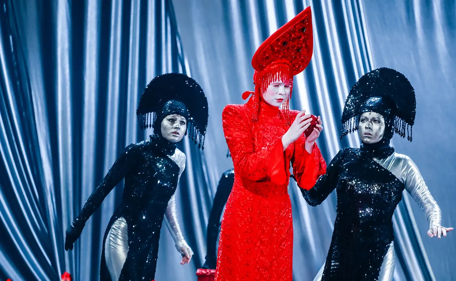

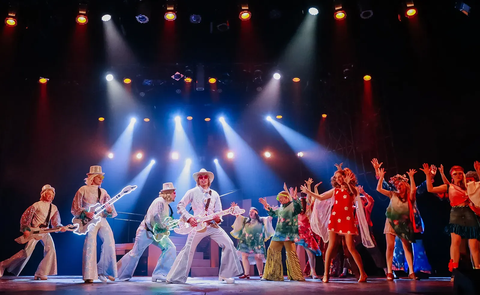
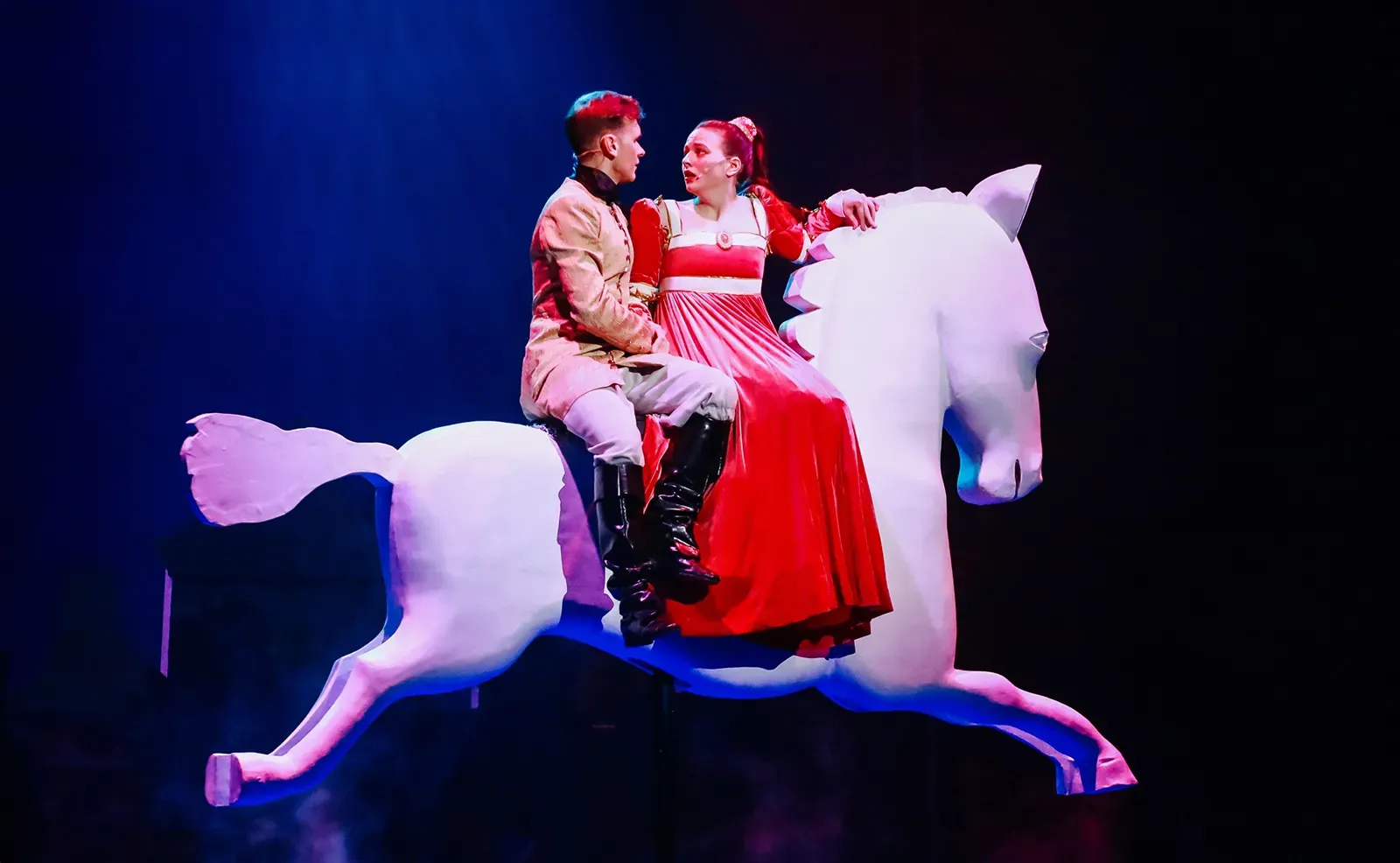
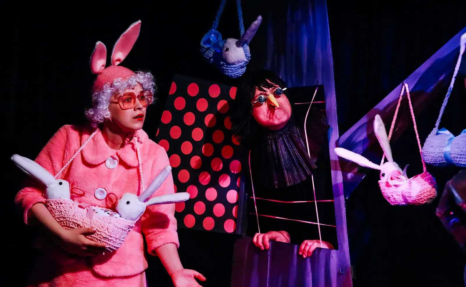
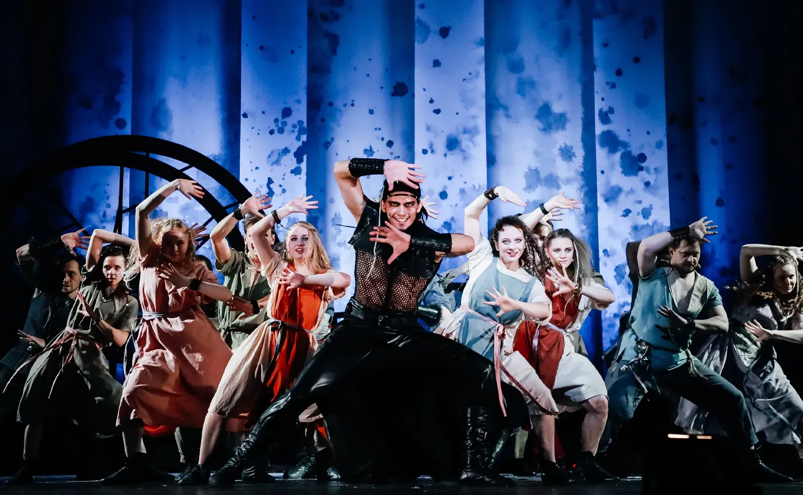
Youth Theatre of Altai is a contemporary theatre with a vibrant energy, where classical repertoire, current drama, and visually expressive formats — even comics — coexist on one stage. The theatre works for audiences of different ages, bringing children and adults together through a clear, stylish, and relevant language of performance. Beyond its productions, YTA builds a cultural environment around itself through educational projects, discussions, and club formats — engaging the audience in dialogue, not just viewing.
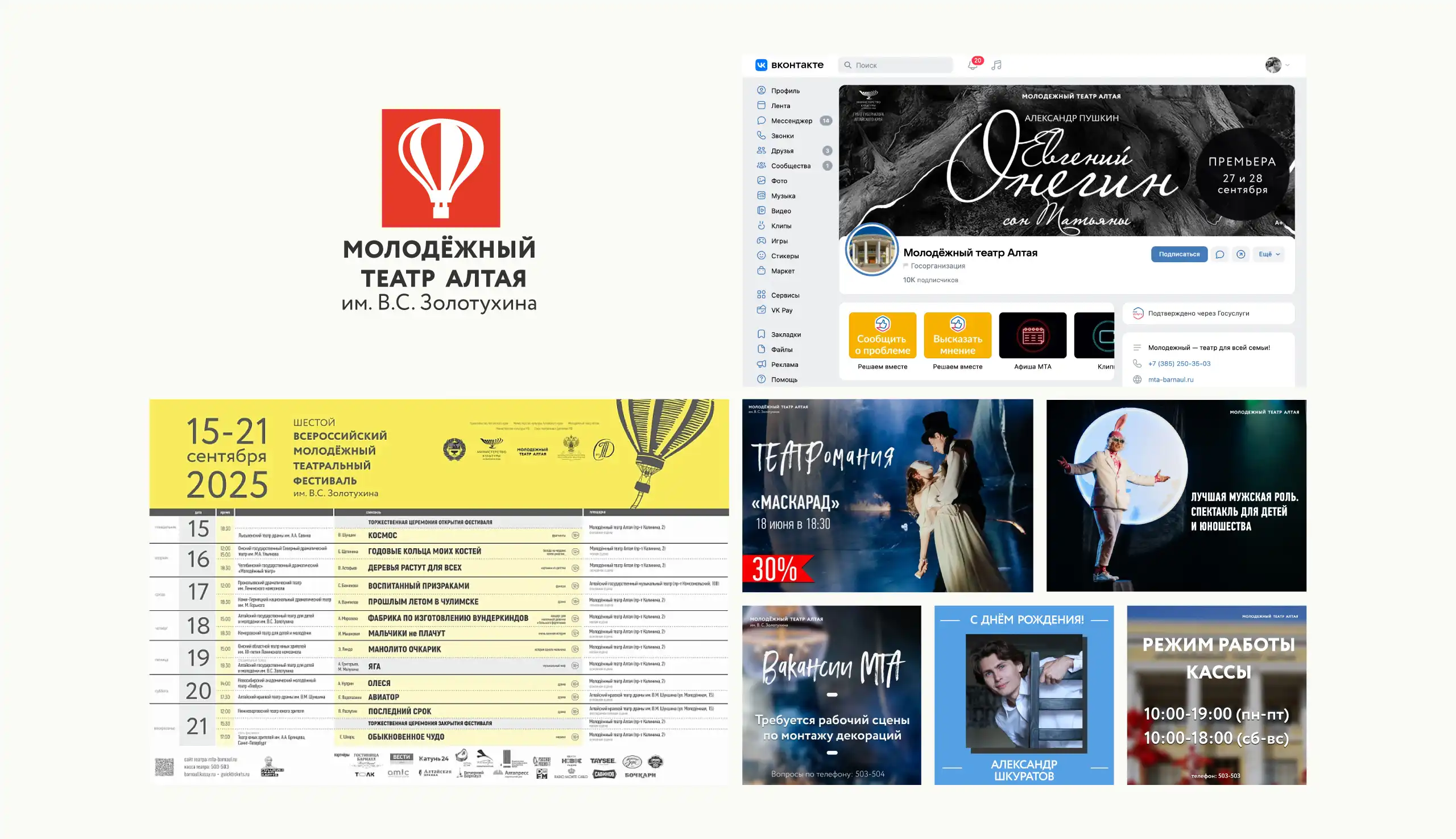
The theatre’s visual identity needed an update: the previous system felt fragmented and largely relied on outdated graphic techniques. Despite being recognizable, the identity no longer reflected the character of the theatre itself — alive, contemporary, open to experimentation, and ready for dialogue with a younger audience.
YTA is a family theatre that has long become a platform for younger audiences and creative projects. The new identity needed to feel contemporary and speak in a modern voice.
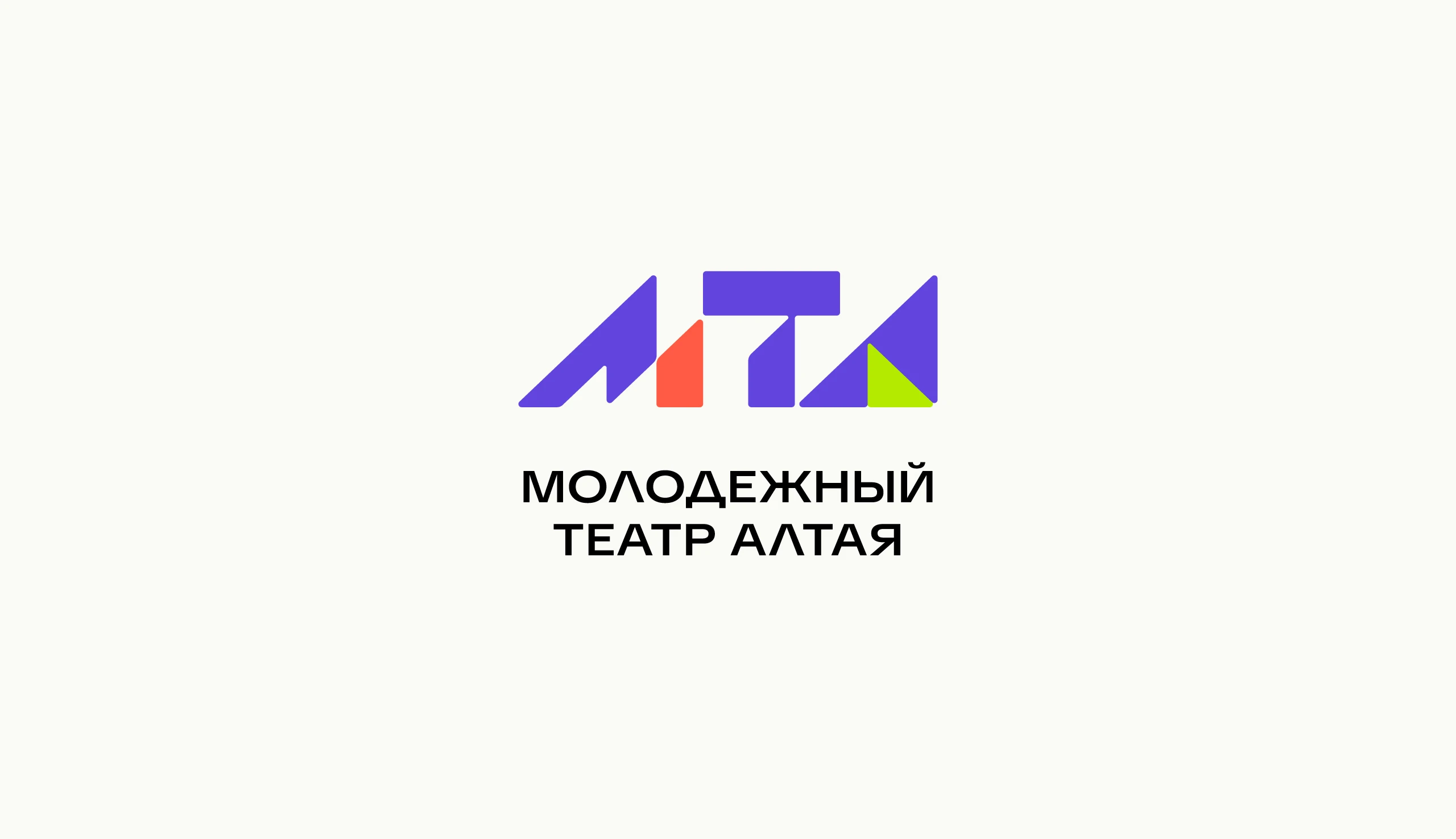
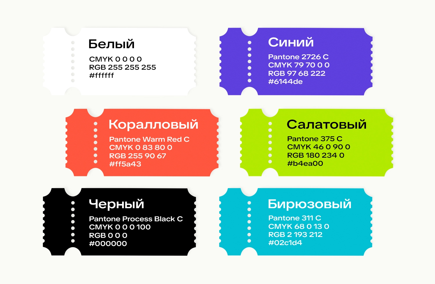
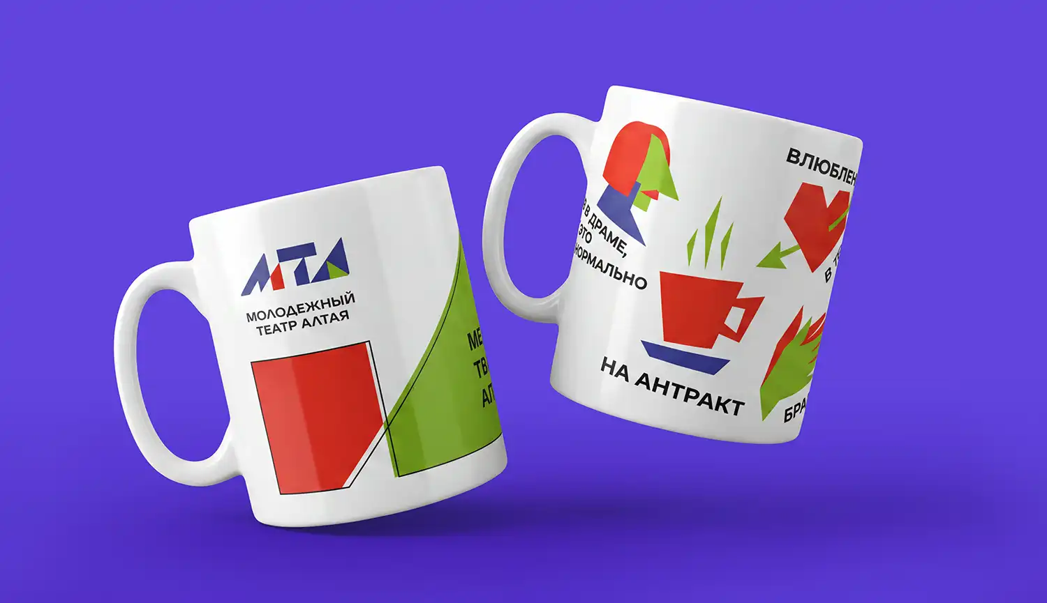
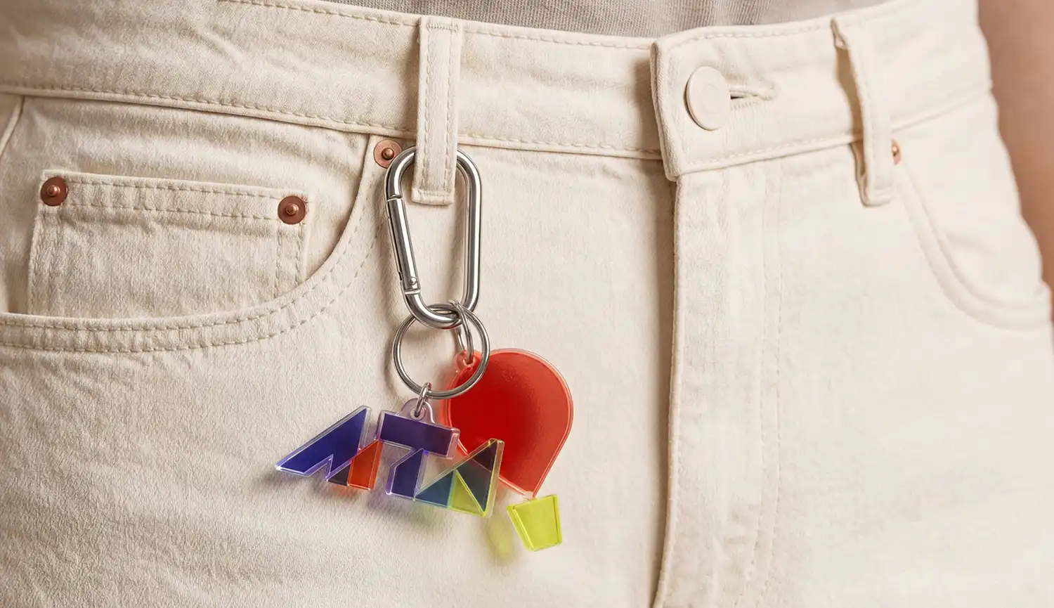
The new YTA logo became bold, graphic, and contemporary. Its geometric form creates a sense of movement, transformation, and the dynamic energy of performance. The accent palette — blue, coral, and lime — reflects inspiration, action, and the freshness of a youthful perspective. It is the mark of a living theatre — modern, open, and always moving forward.
We developed a slogan as a concise interpretation of the abbreviation “YTA,” reflecting the theatre’s values and emotional tone. Built as a rhythm of three short verbs — *Dream! Create! Applaud!* — it sets the pace and is easy to remember.
The foundation of the system is the “YTA” mark and the signature light beams: they highlight what matters, set the rhythm, and structure the composition, while graphic panels make layouts quick to adapt. The color palette, poster typography, and template system make the identity practical across all touchpoints.

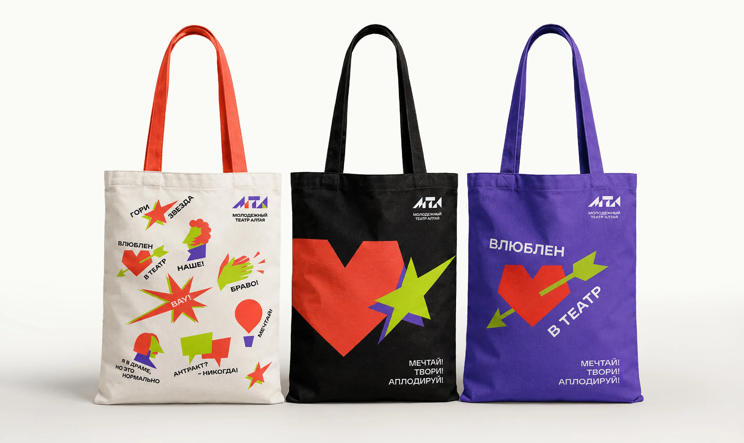
To make the theatre brand feel more alive, emotional, and closer to a younger audience, the visual identity was expanded with a custom illustration system. At its core is a set of bold graphic symbols inspired by theatrical culture. The illustrations follow the same visual logic as the core identity: strong geometry, contrasting shapes, a vibrant color palette, and a sense of movement. As a result, they are perceived not as an additional decorative layer, but as a natural extension of the brand system.
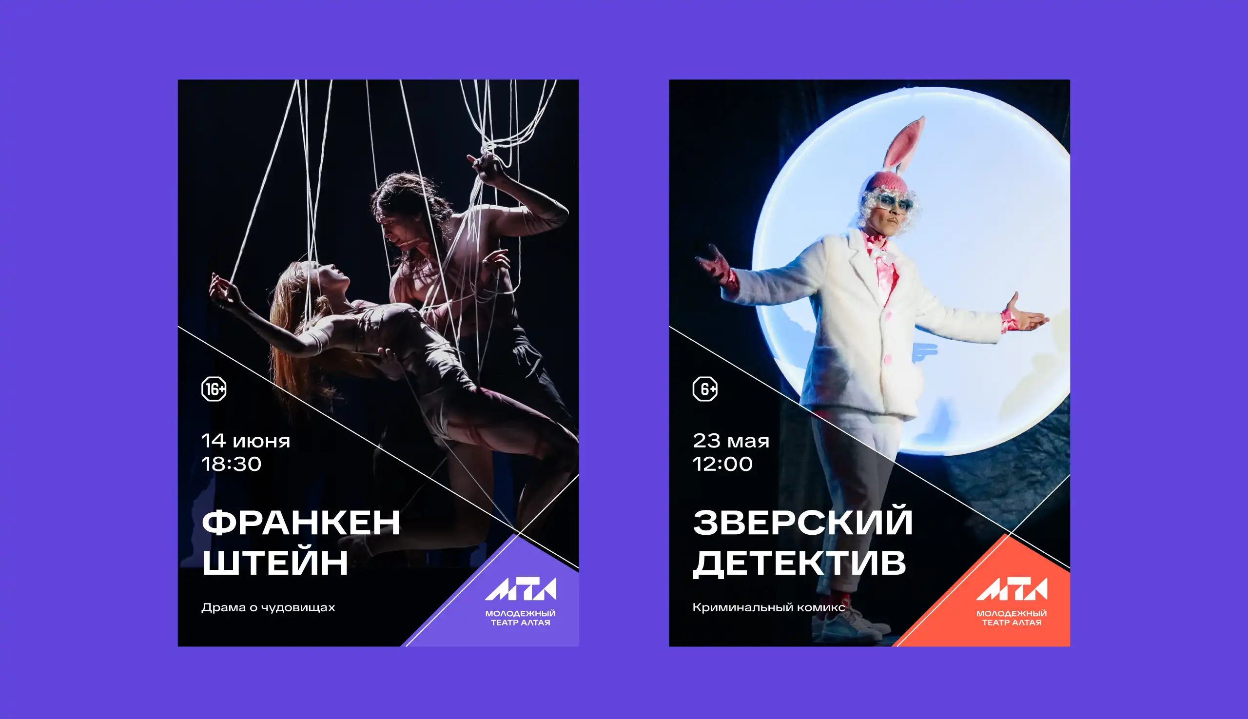
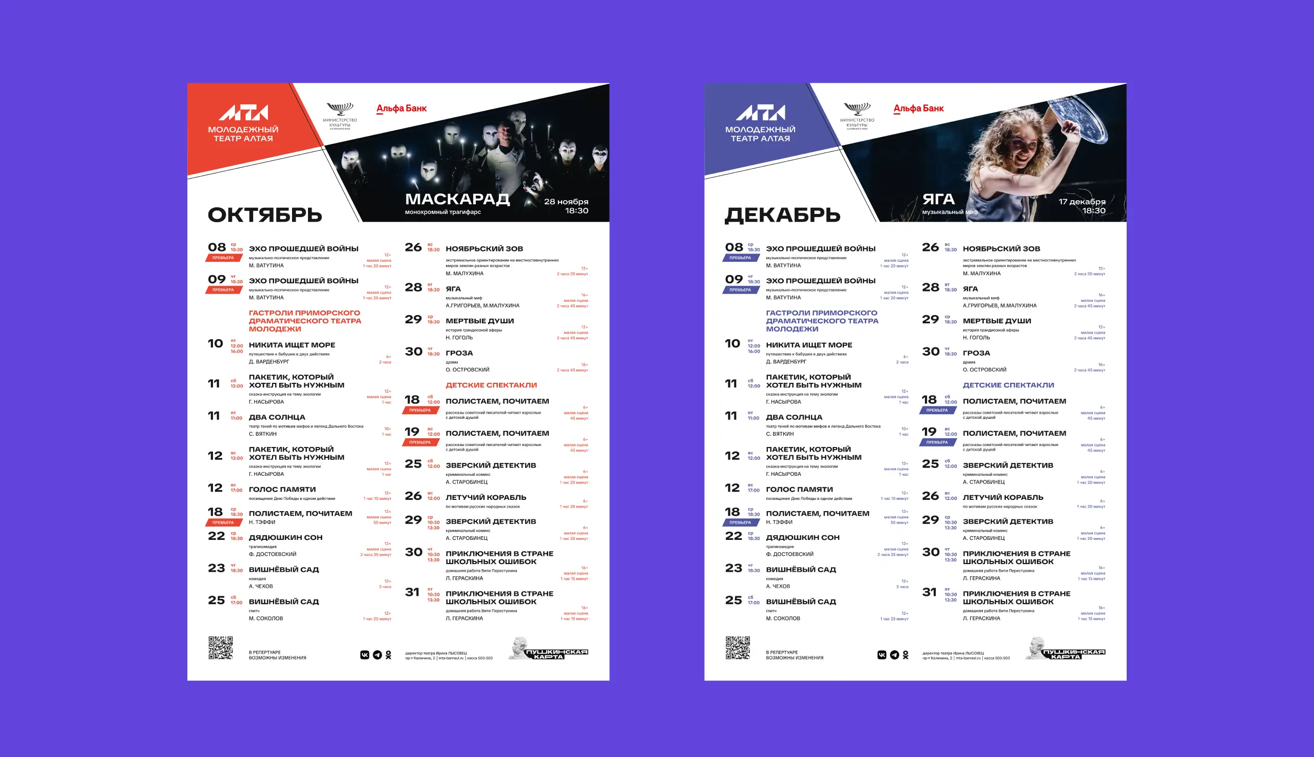
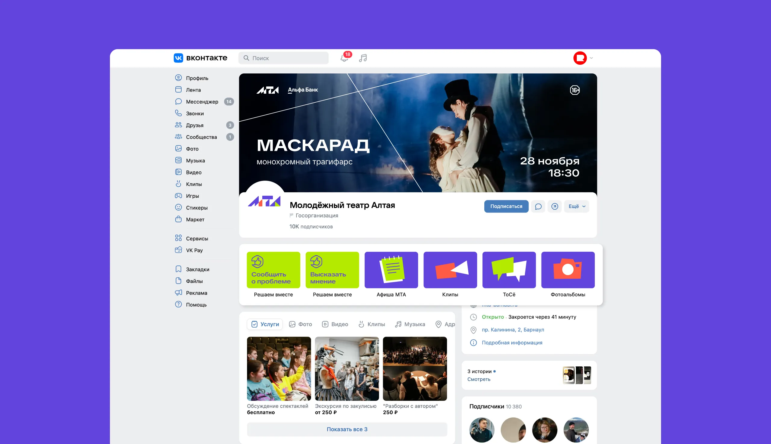
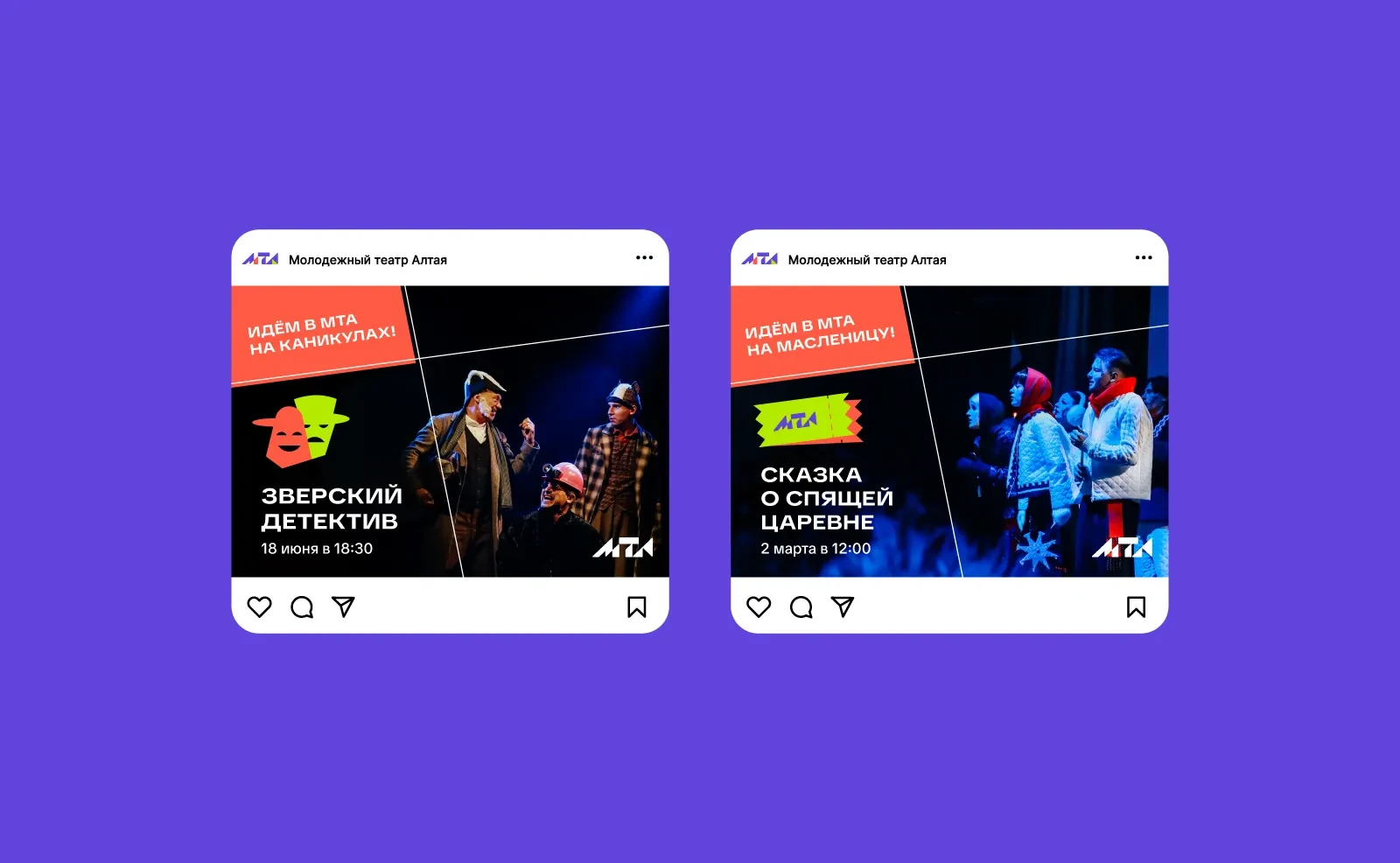
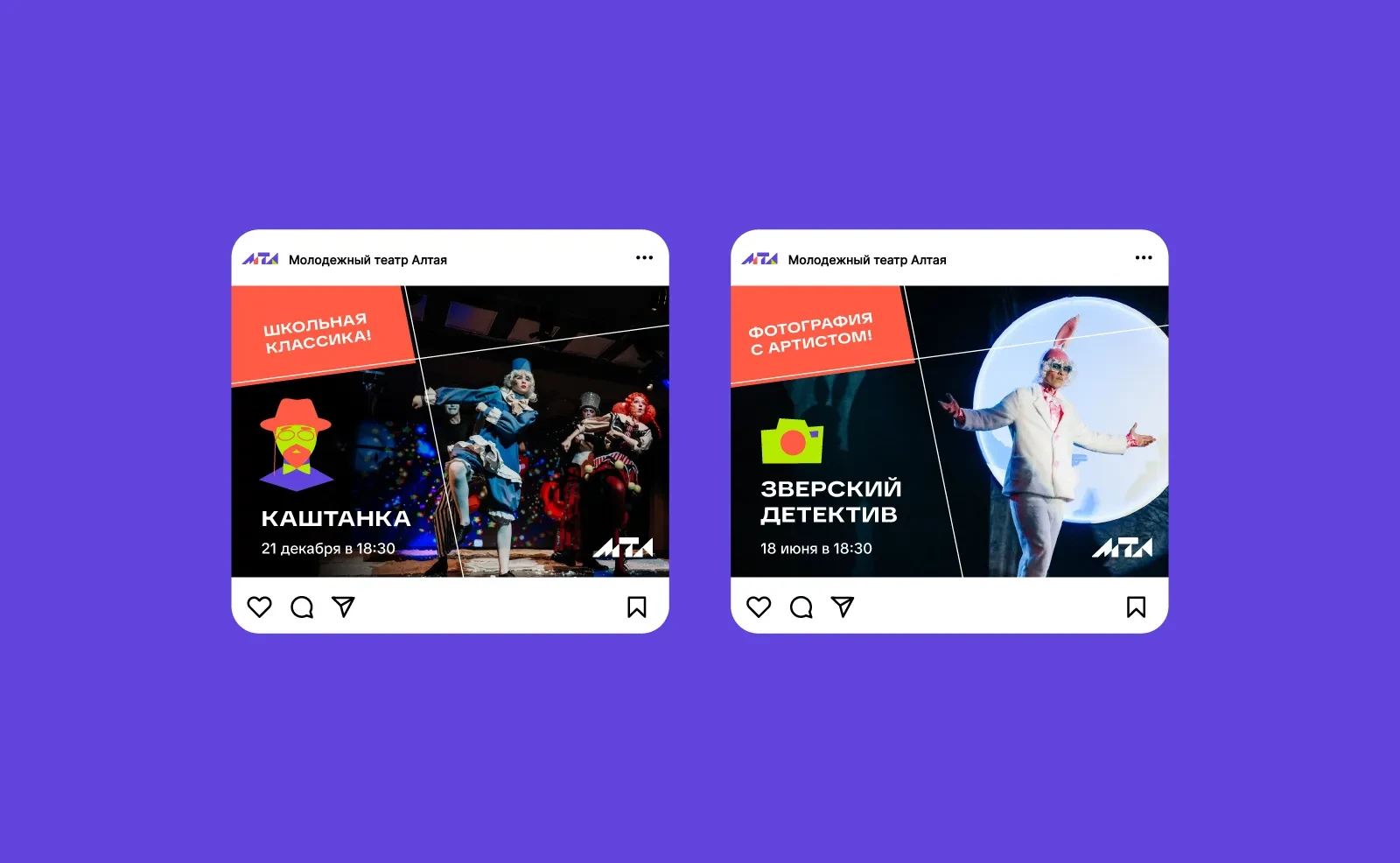
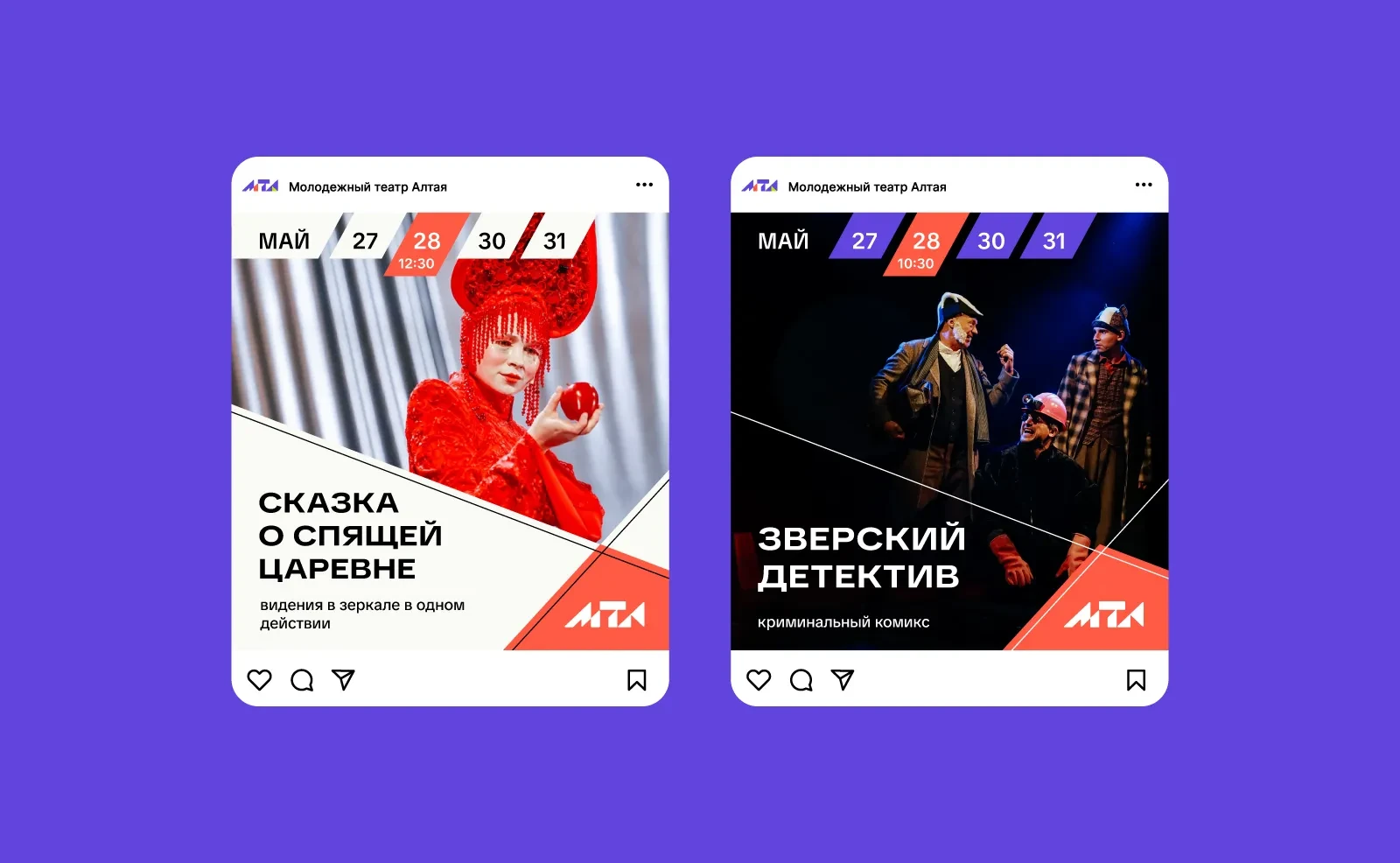
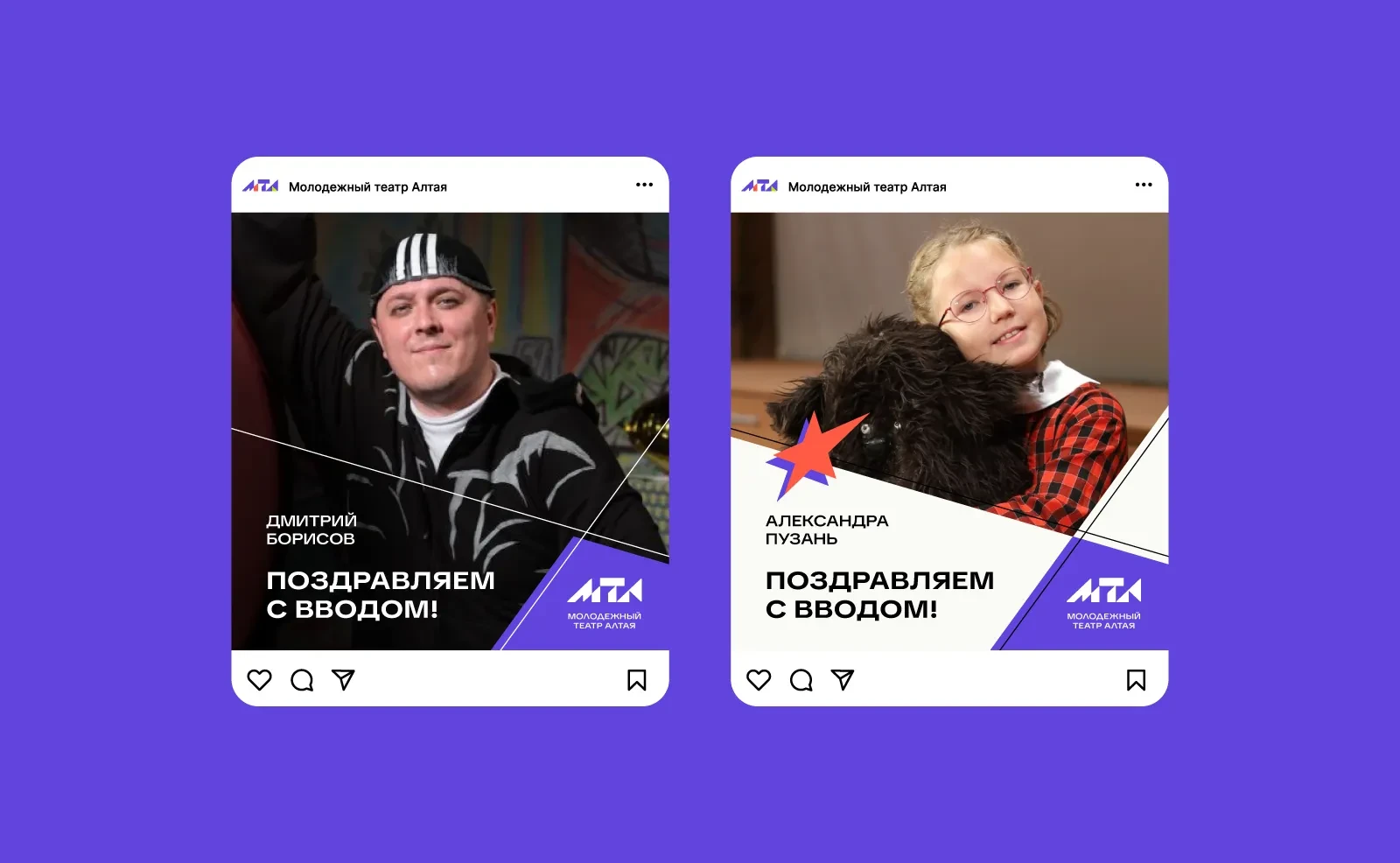
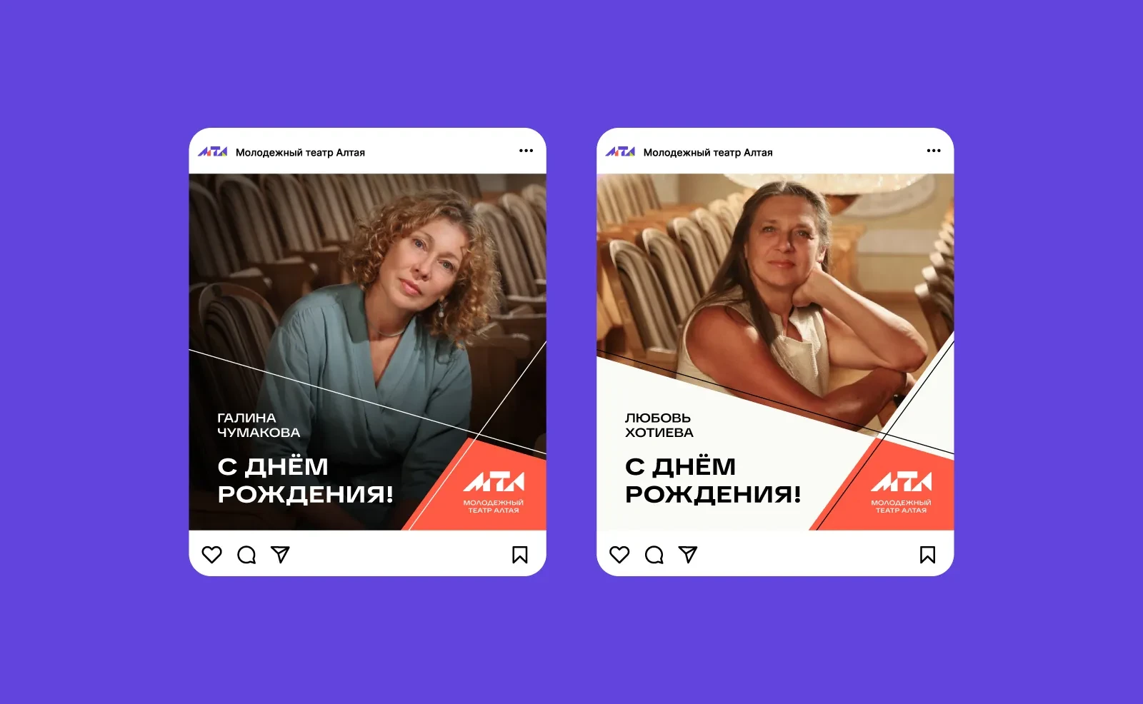
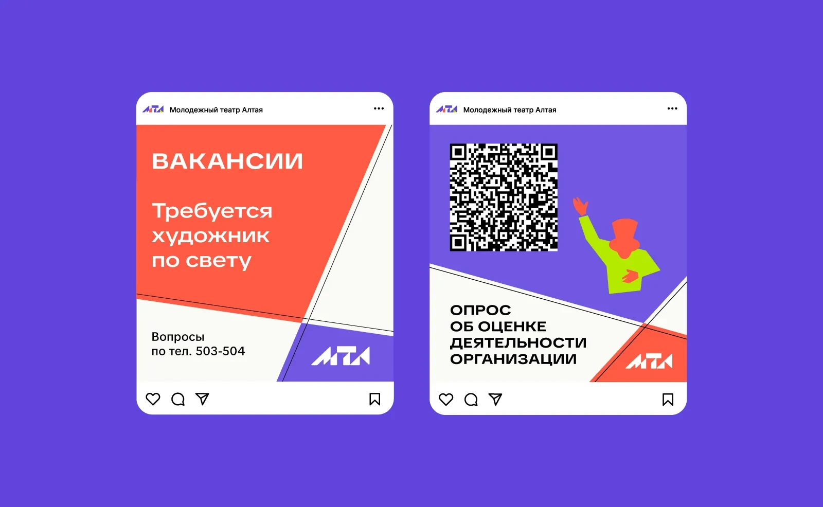
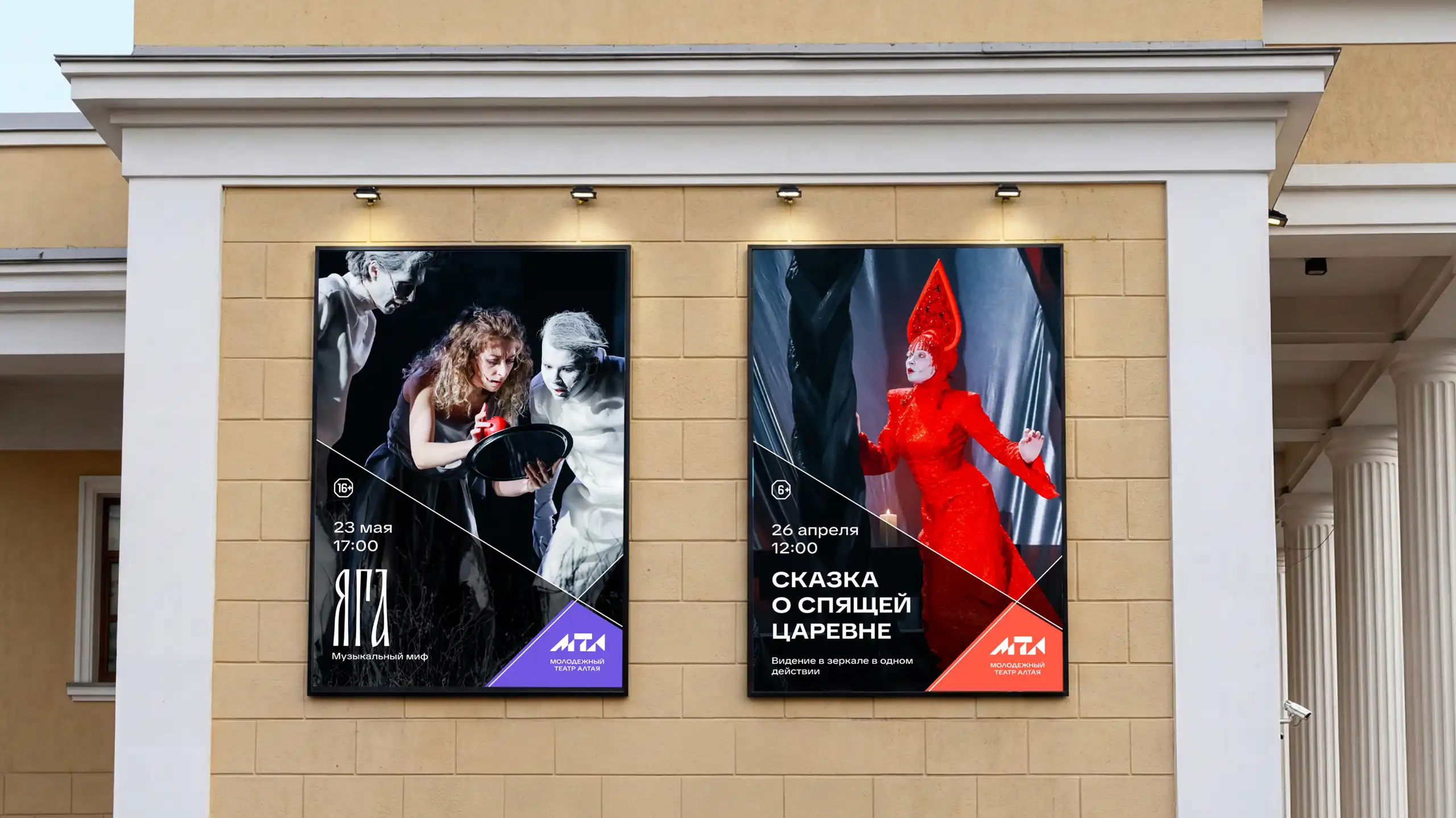
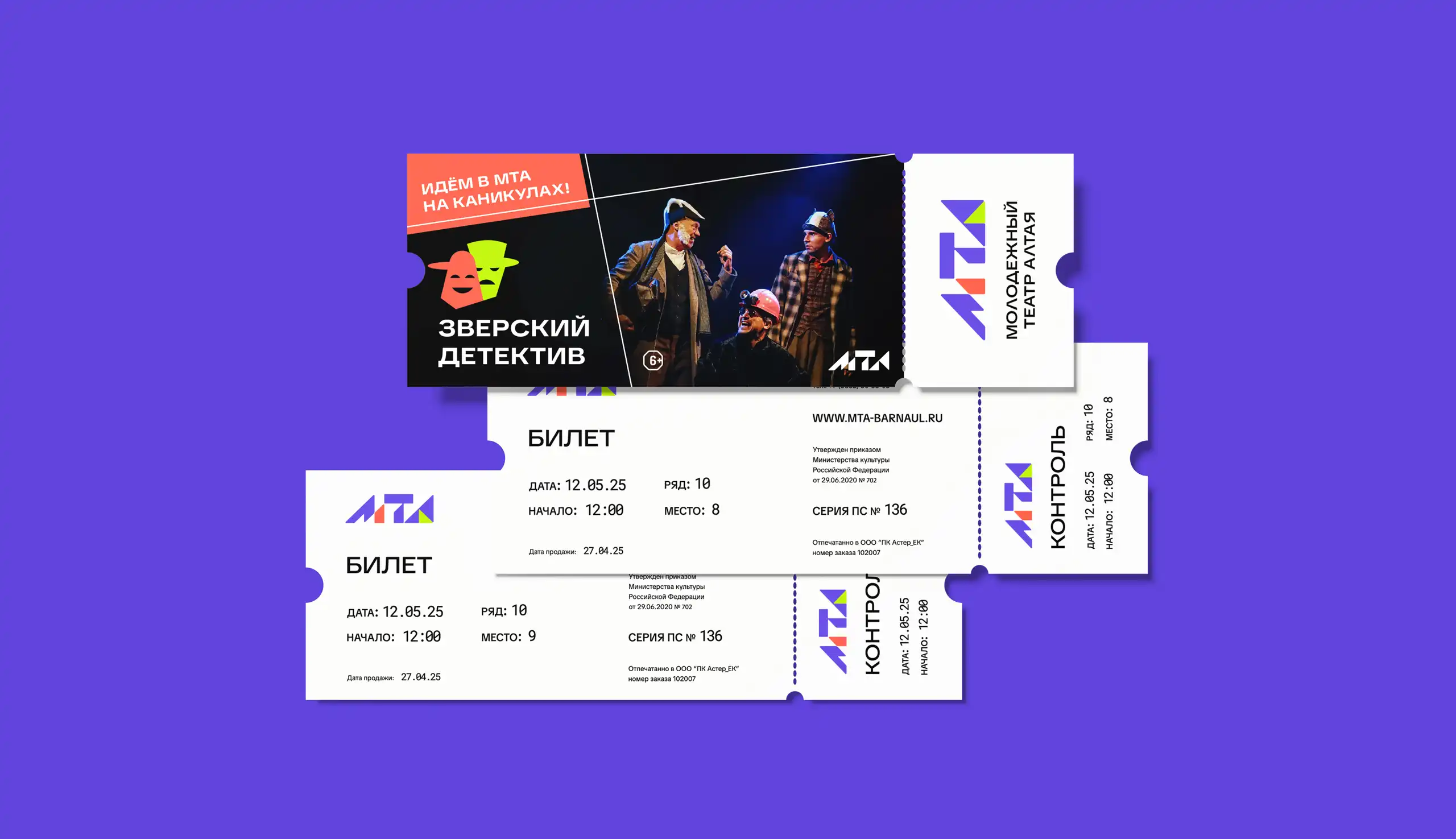
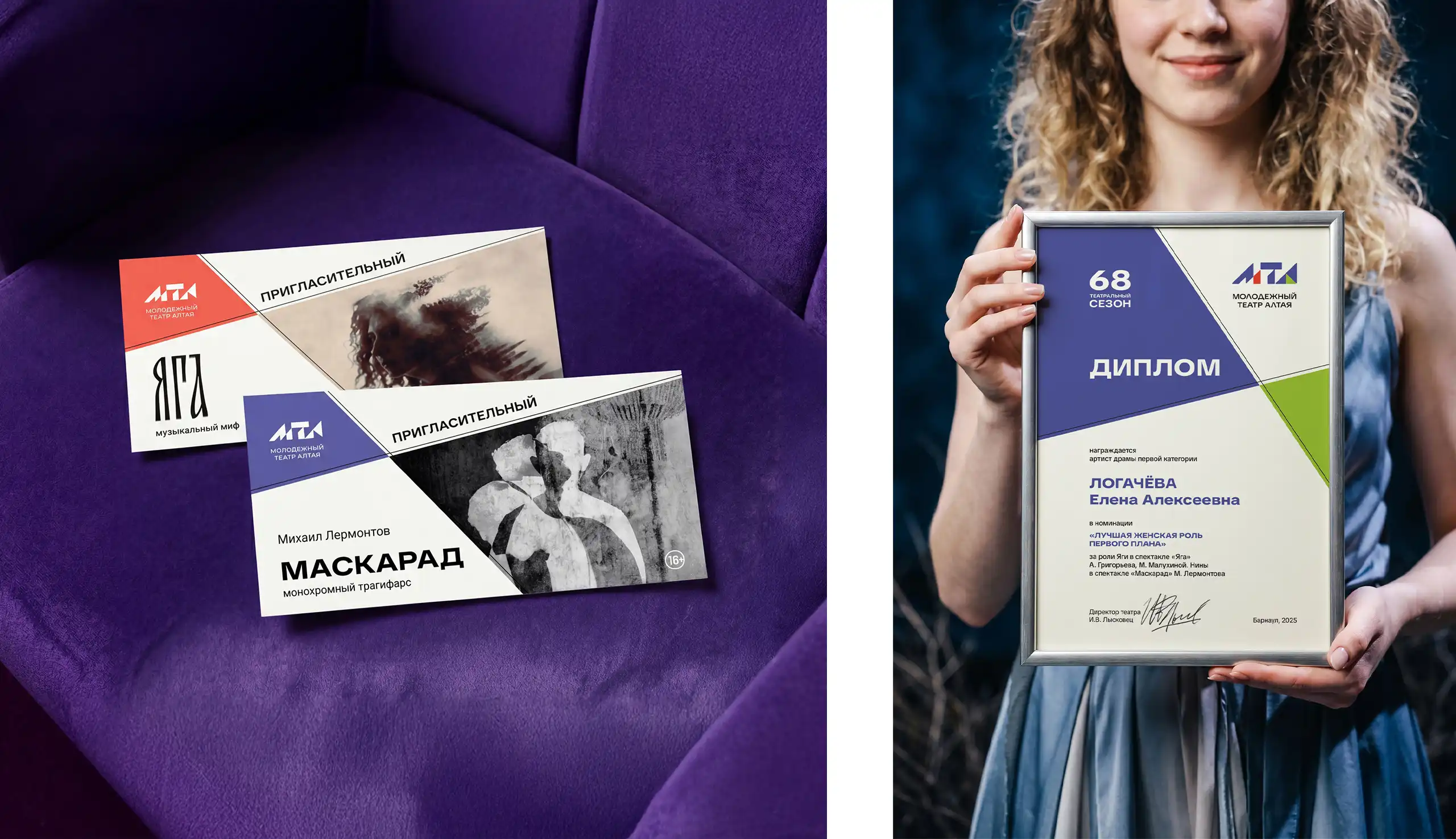
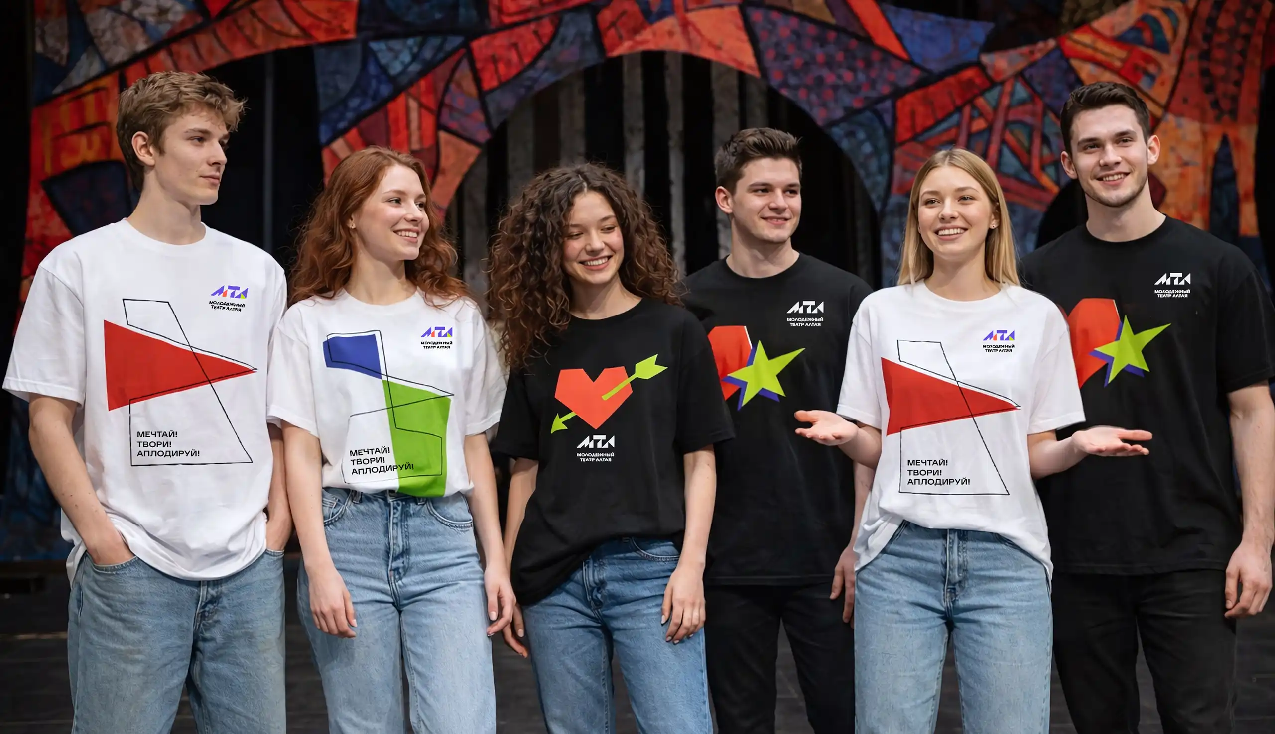
The new identity is built as a flexible modular system: diagonals, dynamic compositions, bold accent colors, and expressive typography create a unified visual language that performs equally well across a wide range of touchpoints.
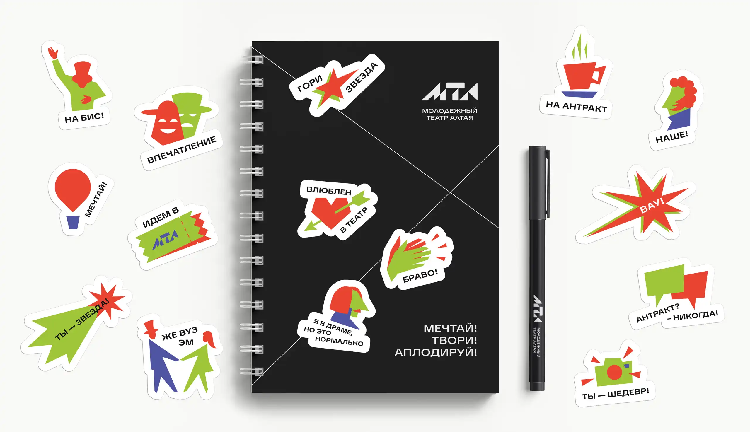
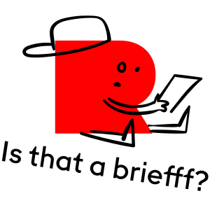
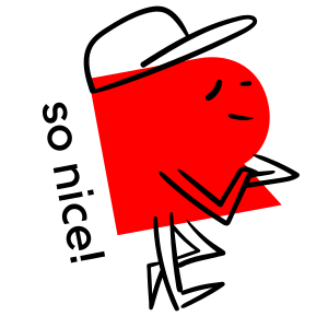
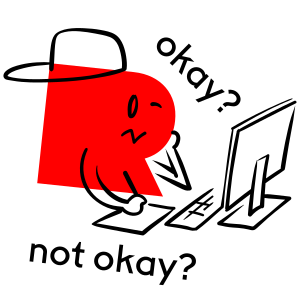
A branded sticker pack became a separate communication tool — a more informal and emotional extension of the identity. It allows the theatre to speak to its audience in a more natural, lively way and adds a human touch to the brand.


Message us in any messenger, or fill out the form — and we’ll give you a call back
Discuss your projectFill out the form or message us directly
Fill out the form or message us directly
Your request has been successfully submitted. We’re already on it and will get back to you soon — we want to approach your request carefully and with full focus.
HomeThanks for wanting to join our team. We review every application carefully and reach out when there’s a role that fits your skills and our needs. If there’s a match — we’ll be in touch.
HomeThanks for subscribing. We’ll send you updates with ideas, projects, and things that we personally find inspiring and relevant.
Home