Youth Theatre of Altai
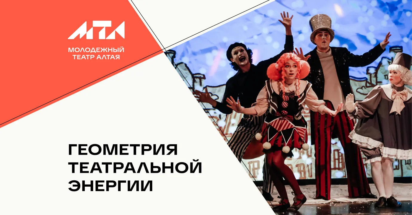
Visual identity for the Youth Theatre of Altai
Привет, мы брендинговое агентство Редин
Loading 0%

Call us: +7 903 969-55-69
24k1 Volokolamskoye Hwy, 9th Floor, Apt. 120, Moscow, 123182, Russia
Telegram Discuss your project
The festival's mission is to bring together the very best works created for children and young people across different art forms.
Our task was to develop the festival's visual identity, from the logo to a cohesive visual system. It was important to create an identity that would appeal equally to children and adults—lively and energetic, yet structured and easy to apply across all communications.
The solution is built around a unified visual system that brings together the logo, a set of category icons, and a cast of characters into a cohesive and flexible communication language. The logo establishes the foundation and recognizability of the brand, the icons organize the festival programme by category, and the characters add emotion and engage the audience. Together, they create a dynamic and welcoming visual environment that easily adapts to different formats.
The Big Children's Festival is an annual event showcasing creative projects for children and teenagers, produced by professional companies across a wide range of artistic disciplines.
The festival was founded in 2018 on the initiative of Sergey Bezrukov, chairman of the public council of the federal party project *Culture of the Small Homeland* and artistic director of the Moscow Provincial Theatre.

The previous visual identity appeared cluttered and outdated. The complex logo, abundance of small details, and inconsistent graphic elements made it difficult to perceive and ineffective when scaled across different applications. Without a unified system, the festival lacked visual cohesion and a contemporary character.

The logo is based on stylized “БДФ” letterforms (the Russian abbreviation for Большой Детский Фестиваль — The Big Children's Festival) and simple geometric elements that overlap and intersect, creating a sense of depth, movement, and a lively, constantly evolving environment.
The intersecting shapes and layers of color create a feeling of lightness and flexibility. This visual language resonates with children and teenagers: everything remains in motion, can easily transform, and is free from rigid boundaries. It reflects the essence of the festival as a space for freedom, play, and a wide variety of creative disciplines.
A dedicated set of icons was developed for each area of the festival. All icons follow a unified style: concise, easy to recognize, and defined by distinctive soft geometry.
Each icon communicates the essence of its category, including theatre, film, animation, literature, creative laboratories, and others, while maintaining a clear visual connection to the festival’s overall identity.


The characters are shown in action: playing, singing, filming, and drawing, reflecting the many forms of creative expression. Their slightly exaggerated proportions and fluid poses enhance the sense of movement and lightness.
The composition brings the characters and visual elements together in a single dynamic flow.


The new visual identity functions as a flexible modular system that adapts seamlessly to different formats, media, and digital communications.


Message us in any messenger, or fill out the form — and we’ll give you a call back
Discuss your projectFill out the form or message us directly
Fill out the form or message us directly
Your request has been successfully submitted. We’re already on it and will get back to you soon — we want to approach your request carefully and with full focus.
HomeThanks for wanting to join our team. We review every application carefully and reach out when there’s a role that fits your skills and our needs. If there’s a match — we’ll be in touch.
HomeThanks for subscribing. We’ll send you updates with ideas, projects, and things that we personally find inspiring and relevant.
Home