“Southern vertical” Château de Talu
Labels for the “Southern vertical” wine collection
Привет, мы брендинговое агентство Редин
Loading 0%

Call us: +7 903 969-55-69
24k1 Volokolamskoye Hwy, 9th Floor, Apt. 120, Moscow, 123182, Russia
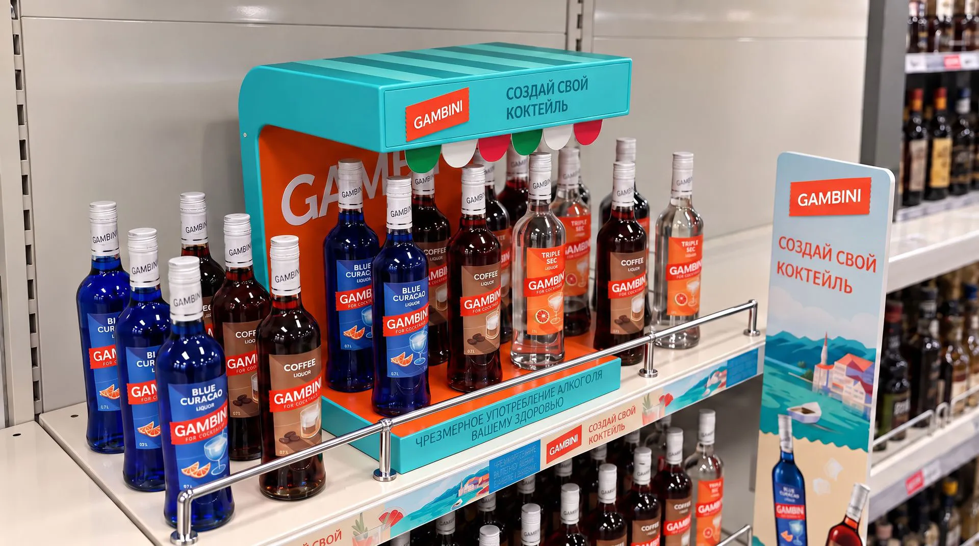
Telegram Discuss your projectCreate a cohesive and recognizable packaging system, enhance shelf visibility, and communicate not just the flavors, but also the emotional experience behind the products. The range includes flavors for both classic cocktails and new creations. Our challenge was to unite them through more than just a consistent label design — we wanted to give the entire line a shared mood: lighthearted, warm, and instantly recognizable.
The design was built around the Dolce Vita brand platform. A ticket-shaped logo, interplay of light and shadow, a sun-drenched color palette, and a distinct mood for each flavor transformed the packaging into an invitation to experience your own Italian summer. The result is a cohesive label system that evokes sunshine, the sea, and the simple pleasure of enjoying the moment.

Who is Gambini? Why is it Italian? What kind of mood does it evoke — and why would someone choose it for a cocktail?
Our challenge was to transform a cocktail ingredient into a brand with a distinct personality.
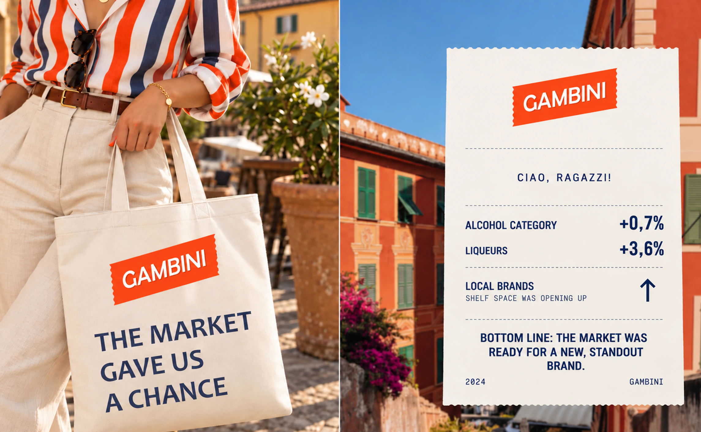
Despite a slowdown in sales in 2022, alcoholic beverages were the only FMCG category to show growth in sales volume.
However, the liqueur market followed a different trend: sales volumes were declining, while revenue was growing slightly. The departure of international brands created new opportunities for Russian producers. Local companies actively moved into the newly available market space, launching their own products. By the end of the first three quarters of 2022, Russian brands accounted for the majority of new product launches in the liqueur and bitter categories.

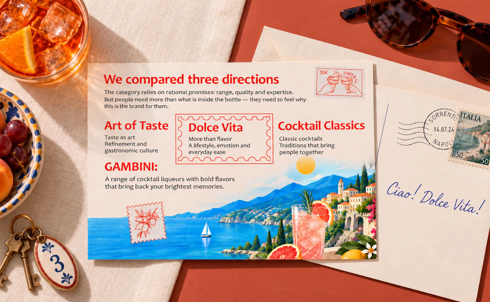
The design process began with an in-depth study of the brand, the category, and two key audiences: professional bartenders and consumers who enjoy cocktails. Our approach was based on a packaging audit, competitor analysis, in-depth interviews, and quantitative surveys.
The research helped us understand not only what people expect from the product, but also the role Gambini could play in their lives.
When choosing a cocktail, people choose more than just a flavor — they choose the atmosphere and experience they want to enjoy. For Gambini, this insight marked a shift from focusing on the ingredient to building a brand that evokes warm memories and invites people to share those moments with others.
We searched for Italy not on a map, but in the feelings it evokes. We chose not to invent a story about a secret recipe or a distant past. The brand already had a strong foundation: vibrant flavors, cocktails, summer getaways, and a carefree Italian spirit.
Rather than creating yet another "premium spirit with a heritage story," we wanted to design a vibrant label that captures a moment you wish could last forever. We drew inspiration from sunlight, the sea, architecture, long dinners, unhurried living, and effortless conversations.

Gambini isn't about elaborate rituals or an exclusive cocktail culture. It doesn't expect you to be a mixology expert or tell you the right way to enjoy the moment.
It's about cocktails that are easy to make at home, at a party, or in a summer bar. Gambini turns the good life from a distant dream into a feeling you can share right here, right now.

Gambini speaks in a simple, friendly way, like a bartender sharing a great cocktail recipe. It offers guidance rather than lectures, encouraging people to try something new without complicated jargon or snobbery.
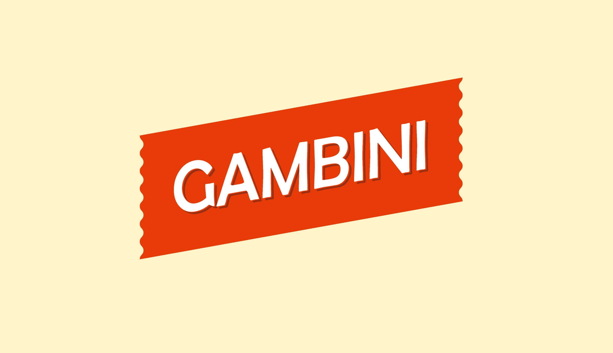
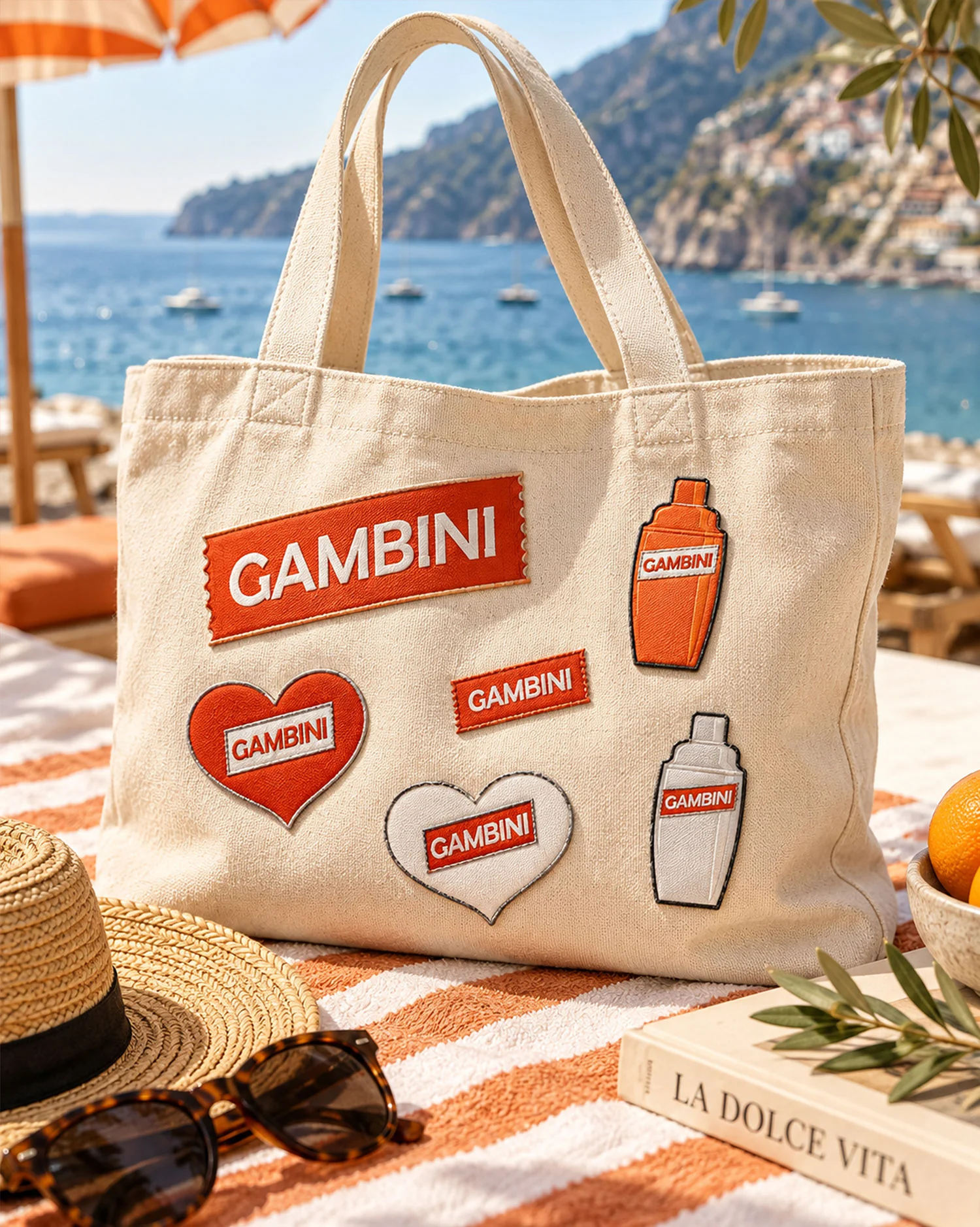
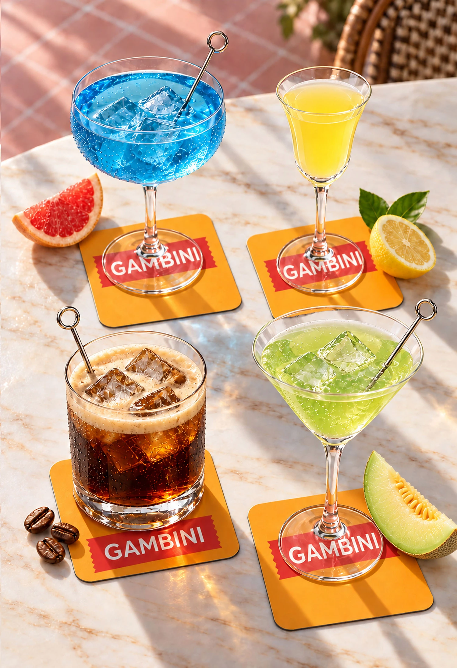
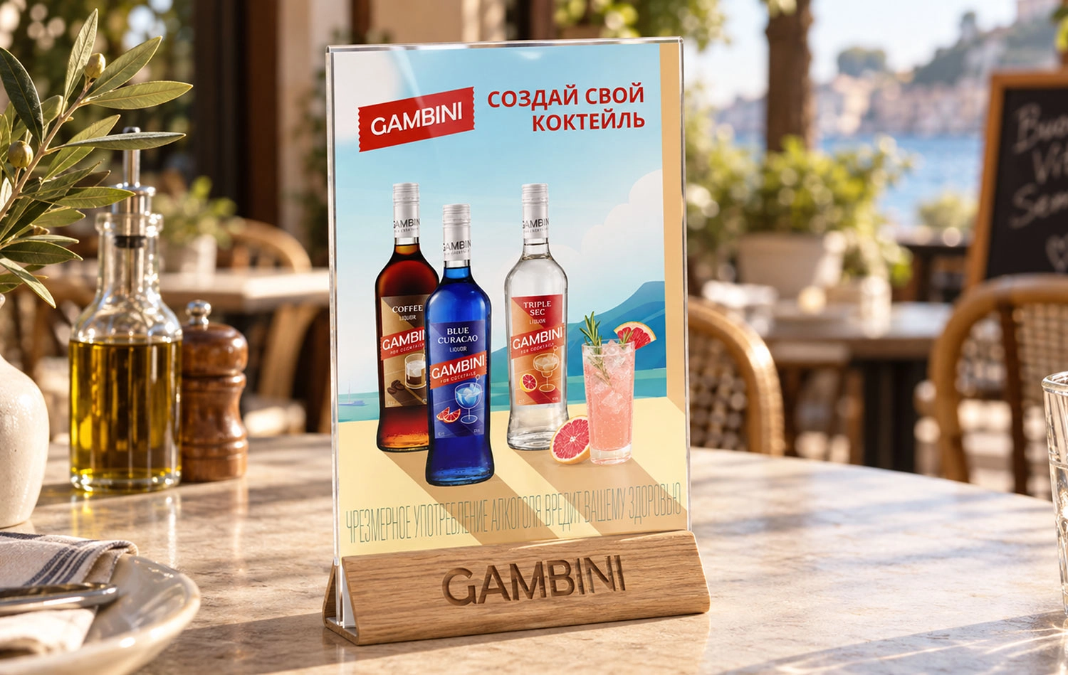
The logo works like the vibrant sign of a small seaside bar. Its tilted, ticket-shaped design makes it eye-catching, simple, and approachable. The identity system includes primary, simplified, and alternative versions of the logo, all used without arbitrary distortions or effects. The bold orange-red background instantly draws attention and remains recognizable on bottles, coasters, and posters.

We set out to create more than just liqueur packaging — we wanted to create a mood. Our visual language grew out of the atmosphere of an Italian summer: warm, bright, and carefree, like that perfect hour when the sun is still shining and the whole evening of easy conversation lies ahead. All that remained was to make that feeling visible. The answer was light. Sunlight sets the mood and becomes the main character of the composition. Blocks of color distinguish the flavors while uniting the range into one cohesive system. Crisp shadows add depth and rhythm, capturing the atmosphere of a familiar Italian midday.
The visual style is built around the contrast of light and shadow. Graphic glasses, sharp cast shadows, and bold blocks of color create a distinctive look. The sun sets the mood, while the shadows add a graphic quality. Together, they turn each label into a small scene from an Italian summer day.
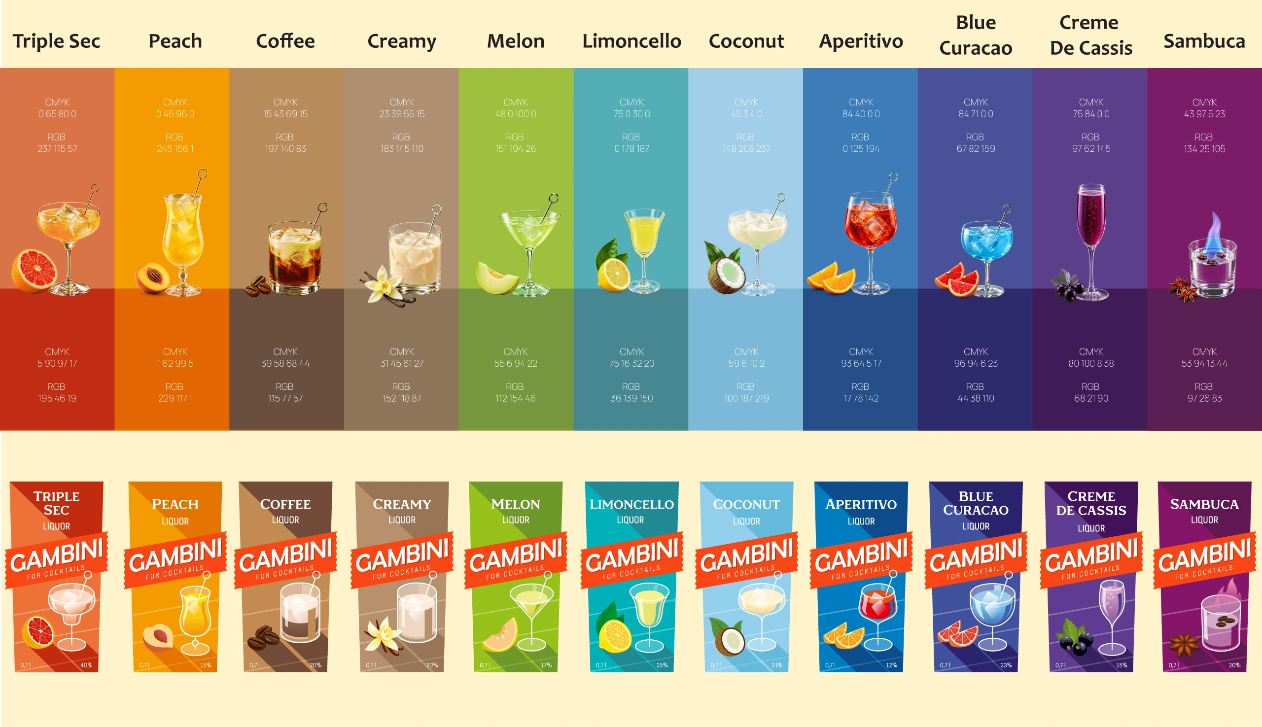
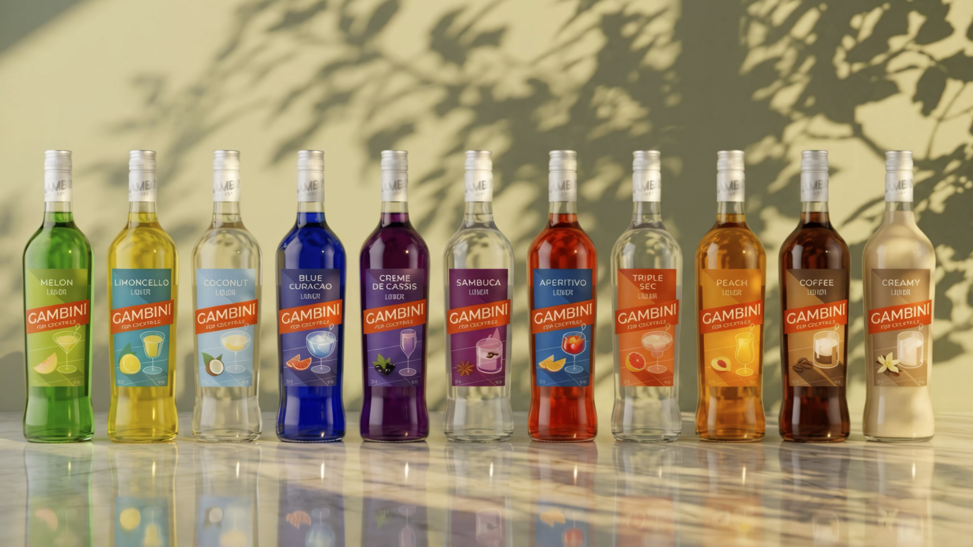
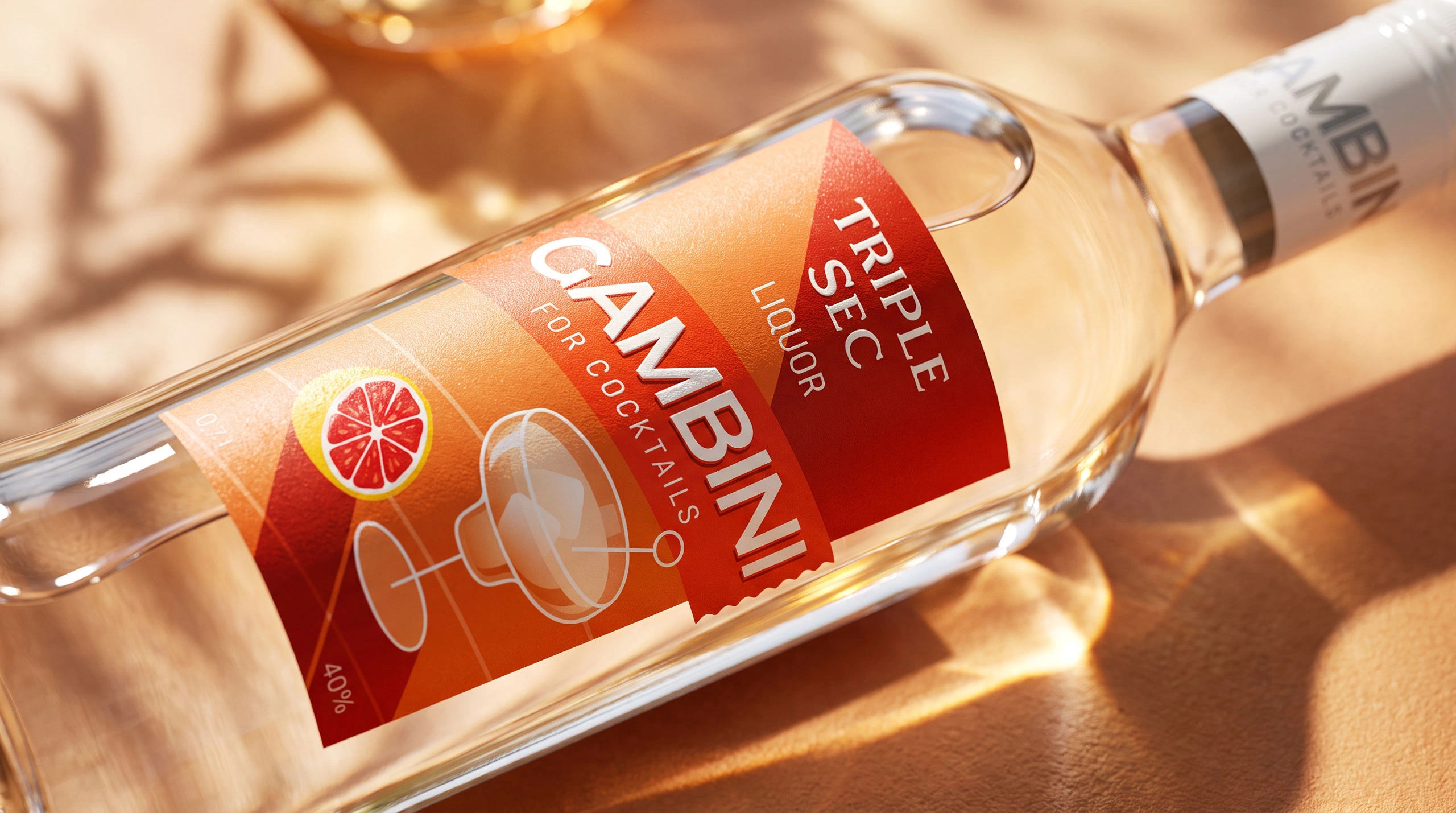
A unified visual system brings together 11 flavors while preserving the individual character of each one. Every label is built around a shared composition: a prominent flavor name, its own color palette, the ticket-shaped logo, an image of the cocktail, and flavor cues. This makes the range easy to navigate and helps distinguish the products from one another. The cocktail image suggests how the product can be used, turning it from a standalone ingredient into the base of a finished drink. Selective varnish and embossing add tactile accents and make the packaging more memorable.
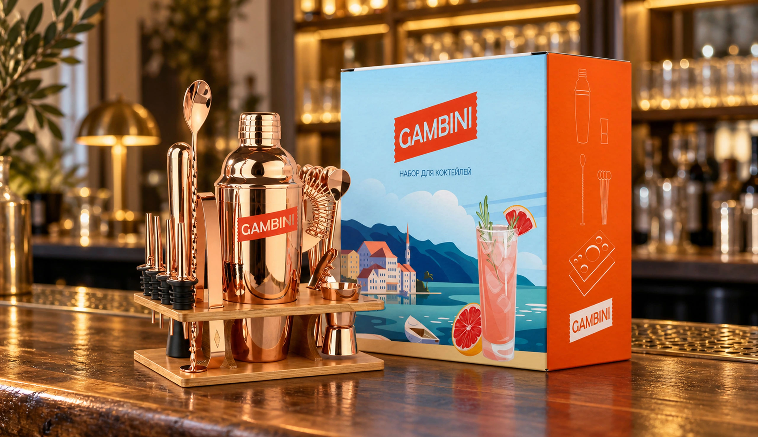


For consumers, Gambini is a ready-made mood. Clear flavors, vibrant colors, and an easy way to choose the right cocktail ingredient.
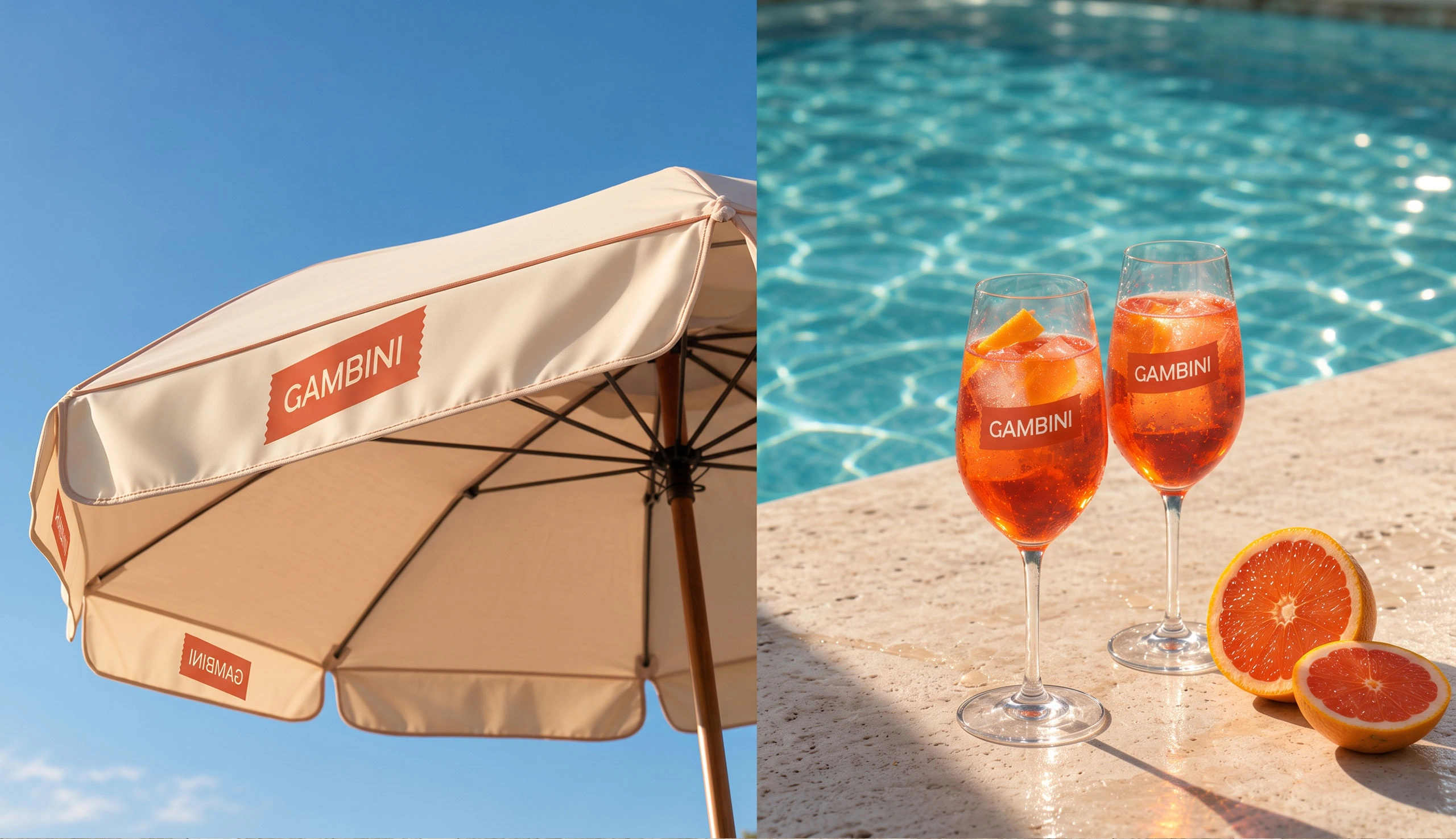
For the brand, it's a recognizable visual system that can be extended across different touchpoints.
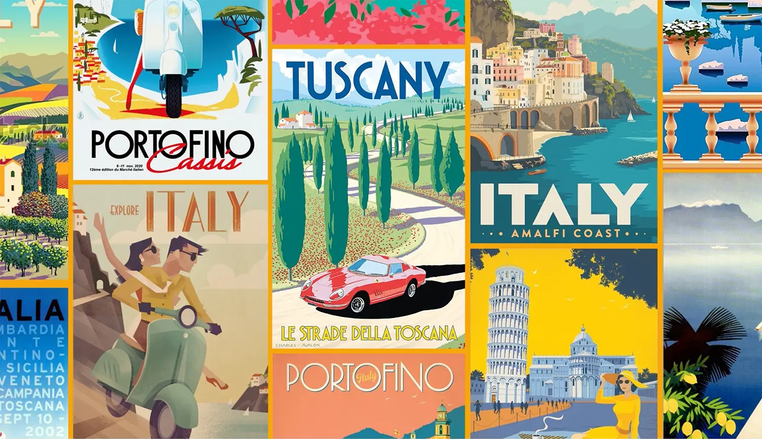
Each flavor has its own personality, yet the entire range feels like one sun-drenched family. To connect with the audience, the visual system is complemented by a distinctive photographic style: natural light, clear glass, ice, vibrant ingredients, and poster-inspired graphics in the background.


Message us in any messenger, or fill out the form — and we’ll give you a call back
Discuss your projectFill out the form or message us directly
Fill out the form or message us directly
Your request has been successfully submitted. We’re already on it and will get back to you soon — we want to approach your request carefully and with full focus.
HomeThanks for wanting to join our team. We review every application carefully and reach out when there’s a role that fits your skills and our needs. If there’s a match — we’ll be in touch.
HomeThanks for subscribing. We’ll send you updates with ideas, projects, and things that we personally find inspiring and relevant.
Home