How REDIN and Dymshits & Partners increased the perceived value of snack products by 75% through research and branding
- In FMCG, packaging often seems like the most obvious tool: make it brighter, more appetizing, and more noticeable on the shelf. But when a brand enters a category without a validated hypothesis, attractive design alone may not be enough. Consumers make decisions quickly, yet those decisions are driven by specific motivations: why they need the product, when they buy it, what price feels reasonable, and what kind of image they trust.
- The client came to REDIN with the task of refreshing a sweet snack brand. Initially, there was a single brand, Milanti. The plan was to develop two products under it in a similar two-compartment format: marshmallows and biscuit sticks, both paired with chocolate spread in the same pack.
- At first, the brief looked like a straightforward design and rebranding project. But during the very first meeting, an important idea emerged: the brand needed to be developed “mathematically right.”
- This was not about finding a literal formula. It was about moving away from subjective taste. The client wanted more than a design based on personal preference. They wanted a clear system of reasoning: why the product should have a particular name, why the packaging should look a certain way, and how these decisions would influence brand perception.
- The research phase was conducted together with Dymshits & Partners. On the REDIN side, the project team included Project Lead Yulia Polyakova; Brand Strategist Alexey Kovalenko; Art Directors Alexander Pachkin and Sergey Redin; Designers Ekaterina Soldatova, Kristina Babina, and Alena Blagodarova; Motion Designer Konstantin Mukhamedzyanov; and Prepress Specialists Alexey Sidorkin and Egor Bychinsky.
- As a result, one brand evolved into two independent brand systems: Vkusnyashki for marshmallows and ShokoViva for biscuit sticks.
The challenge
- The client had the products, production capabilities, and initial packaging solutions, but there was no certainty that the brand would work effectively on the shelf. In the sweet snack category, this is critical: the product competes not only with direct alternatives but with every treat a consumer might choose “with tea,” “for a snack,” “for the kids,” “to treat myself,” or “to take on the go.”
- At first glance, both products could have been developed under a single brand. They belonged to similar categories, shared a chocolate-based proposition, and followed a similar consumption ritual: take the base product, dip it into the spread, and enjoy an instant sweet treat.
- But the research showed that a similar format does not necessarily mean the same purchase motivation. Marshmallows were perceived as a small moment of joy, a treat for yourself, a child, or someone close to you. The biscuit sticks were seen as a more functional snack: something to quickly recharge, feel fuller and more energized, and continue with the day.
The task
- REDIN needed to create a brand system based not on subjective impressions, but on real data about the product and its audience.
- At the beginning, it seemed reasonable to develop both products under one brand, but that assumption needed to be tested with consumers. We therefore built the process step by step: two rounds of taste testing first, followed by the brand platform, naming, strategy refinement, name testing, packaging development, and consumer testing of the design concepts.
- This approach was designed to reveal how consumers perceived each product, what motivations drove their choices, and which decisions genuinely increased purchase intent.
- “It was important for us to show that branding is not simply a matter of taste. Design can be bold, emotional, and creative, but it needs an evidence base behind it: research, testing, and an understanding of how consumers make decisions at the shelf.”
Sergey Redin, Founder and CEO of REDIN
Solution: from research to brand
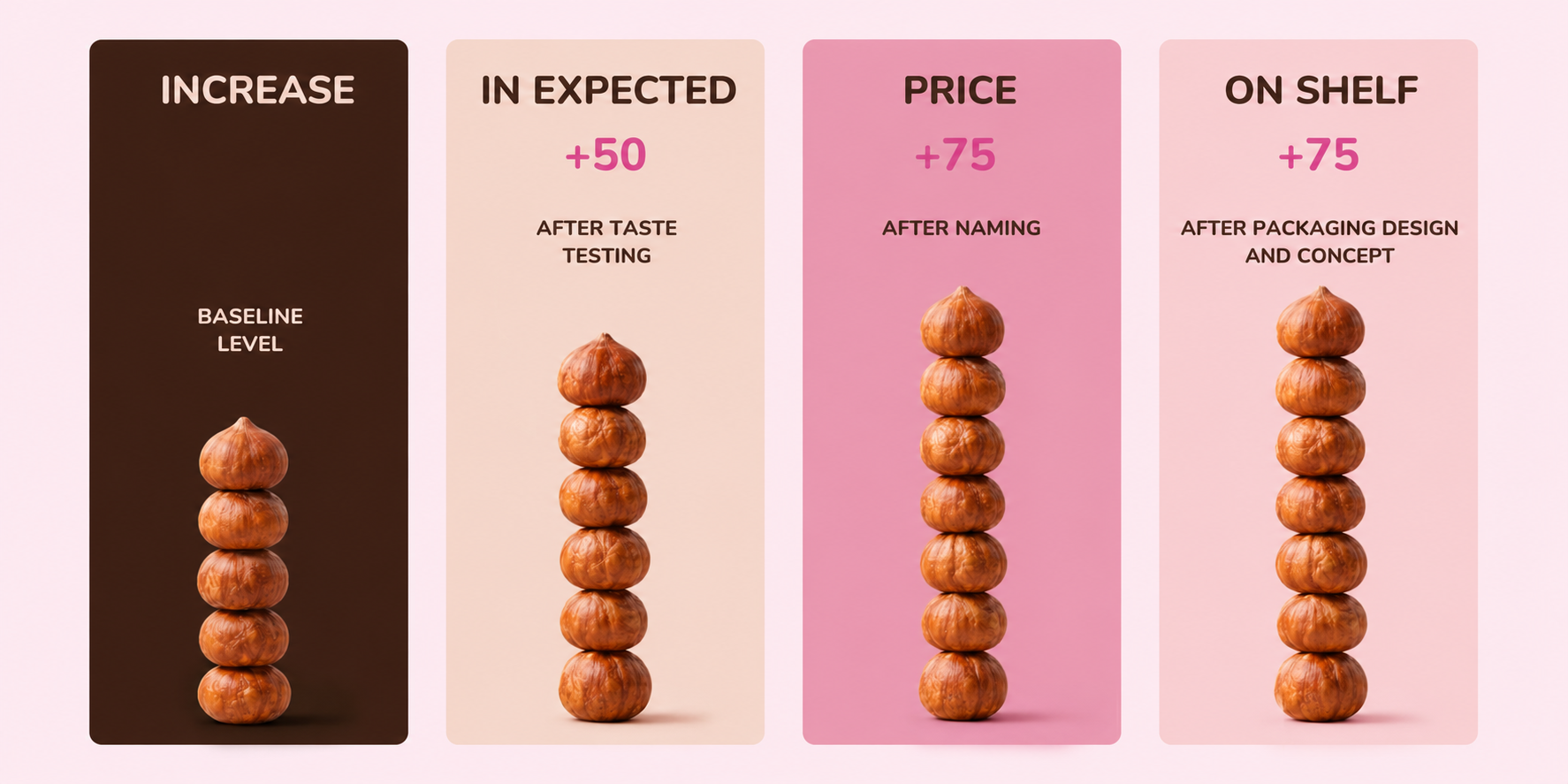
- The first stage was taste testing. Together with Dymshits & Partners, the team examined how consumers perceived both products, how willing they were to buy them, and what motivations drove their choices. Even at this stage, it became clear that the products had greater potential than initially expected: after taste testing, the expected shelf price increased by 50% compared with the price originally planned by the client.
- For the future Vkusnyashki brand, the research revealed a strong “treat” motivation: treating yourself, a child, or someone close to you. The product was not perceived specifically as a children’s snack, but as a sweet treat for a broad audience: with tea or coffee, at home, at work, on the go, or simply as a small moment of pleasure.
- This led to the brand platform: Vkusnyashki is a simple everyday sweet pleasure. The brand essence is “a favorite treat.” Its mission is to bring simple moments of joy back into everyday life.
- ShokoViva had a different motivation. The biscuit sticks were primarily perceived as a convenient snack: a quick way to recharge, feel fuller and more energized, stay productive, and continue with the day. Key purchase motivations included “for a snack,” “fullness, energy, activity,” “sweet and tasty,” and “favorite treats.”
- The brand was therefore built around the idea of supporting people throughout the day: ShokoViva is a snack that provides the energy and satisfaction needed to handle the day’s tasks. It is more than just a sweet treat: it is a product that helps you stay ready for whatever the day brings.
- “Naming and design are key brand assets at the shelf. In most cases, a company will not have the budget for large-scale reach advertising. That is why it is essential to know whether the name and packaging might discourage purchase, in other words, whether consumers simply do not like them. Without testing, it is impossible to identify this: even names that seem perfectly good from the client’s perspective can end up among the lowest-rated options.”
Alexey Kovalenko, Brand Strategist on the project - “Research findings often seem obvious in hindsight, yet clients’ initial ideas are rarely confirmed by the data. I continue to be surprised by how much agreement there can be among consumers about a particular proposition despite the enormous range of individual opinions. Without research, you are unlikely to make the right decisions and, of course, you are also likely to set the wrong price.”
Mikhail Dymshits, Founder and CEO of Dymshits & Partners
Naming: not choosing what you like, but testing what works
- After taste testing and developing the brand strategy, the team moved on to naming. By this point, we already understood the role each product needed to play, the motivations behind the purchase, and the image the name had to support.
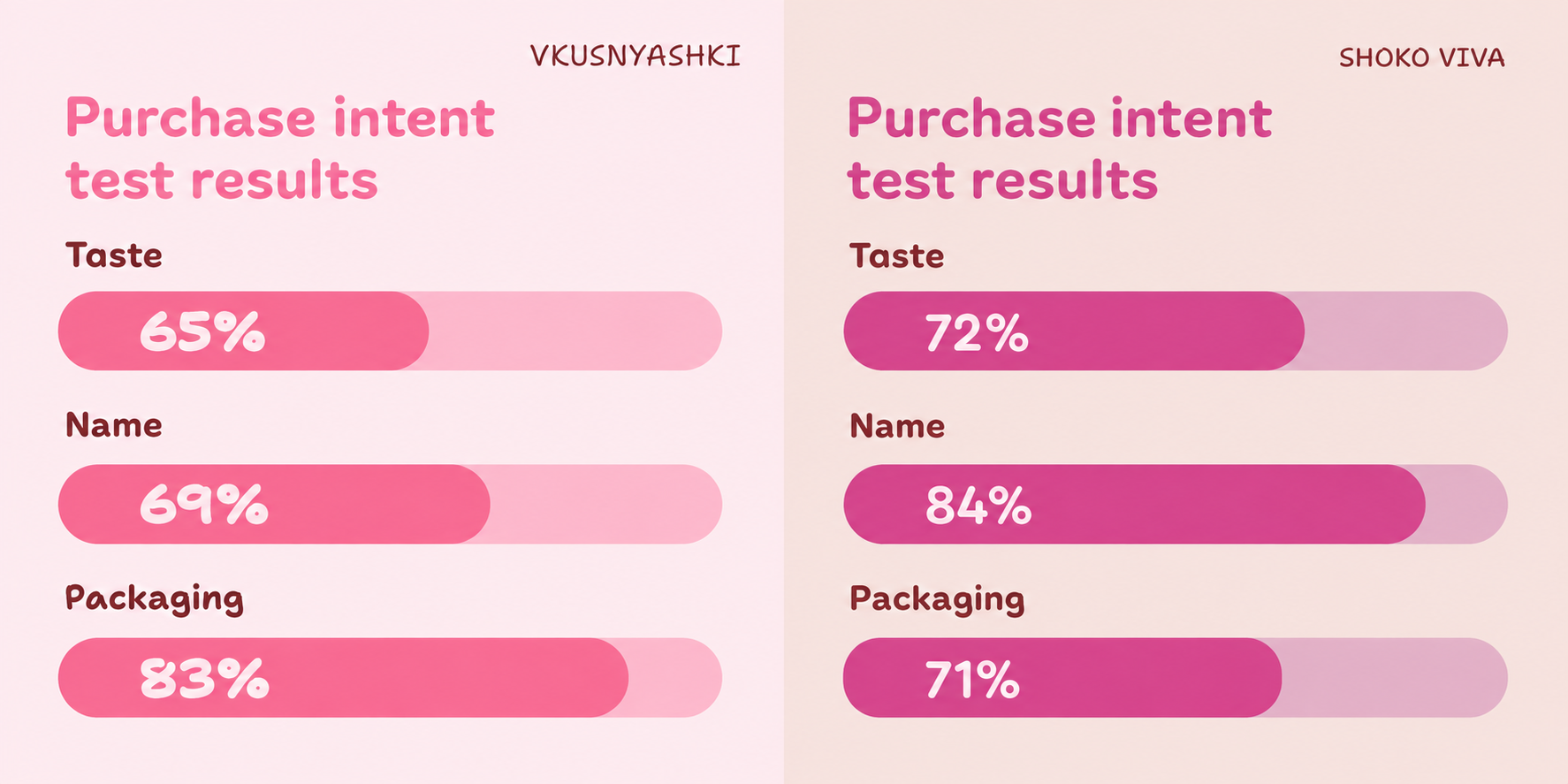
- The approach was not to present a few attractive options and choose the team’s favorite. A broad pool of names was created for the project: around 40 options for Vkusnyashki and 112 for ShokoViva. These were tested with consumers for purchase intent, alignment with the brand platform, and their impact on perceived price.
- For Vkusnyashki, the name needed to communicate a simple emotional idea: a treat you can enjoy yourself or share with someone close to you. The final name felt friendly, intuitive, and immediately understandable within the category.
- ShokoViva had a different role. Its name needed to feel energetic and lively while supporting the idea of a snack that helps people stay in the rhythm of their day.
- Name testing confirmed the strong potential of both products: the selected names increased the expected shelf price by 75% compared with the price the client had planned at the start of the project.
Packaging: creativity as a sales tool
- The next stage was packaging. Here too, the team moved away from subjective selection. Around 20 design concepts were created for each product and then tested with consumers.
- The final choice was based on audience evaluation. The team compared how the concepts were perceived by men and women and looked for the solution with the strongest appeal across both groups. The higher and further to the right a concept appeared on the perceptual map, the broader its potential consumer appeal.
- For Vkusnyashki, the winning concept was a bright, emotional design featuring two characters. It strengthened the brand’s friendly personality, made the product feel more relatable, and supported the idea of a simple sweet pleasure.
- For ShokoViva, a bolder and more dynamic concept won: a girl riding along a biscuit stick. The image brought movement, energy, and memorability to the brand. The packaging became more than a design surface; it became a visual extension of the brand platform, expressing the idea that the product helps consumers stay in the rhythm of the day.
- “At the start, there was no way to predict exactly which design would win. Opinions within the team were divided. But testing showed that bold creative work can outperform a safer solution when it accurately reflects the audience’s motivation.”
Alexander Pachkin, Creative Director at REDIN
Result
- The project demonstrated that a product’s perceived value is shaped at every stage of brand development. Research helps identify the precise purchase motivation, naming strengthens audience interest and expectations, and design establishes a distinctive image on the shelf.
- The main measurable result was the increase in expected shelf price. After taste testing, it rose by 50% compared with the initial level, and after naming, by 75%. The packaging concept maintained the value achieved at the previous stage.
- But the strategic result was equally important: instead of one Milanti brand, the project produced two distinct brand systems with different roles in consumers’ lives.
- Vkusnyashki is a vibrant and emotional brand for marshmallows with chocolate spread, developed through in-depth product research.
- ShokoViva is an energetic brand for biscuit sticks with chocolate spread, developed through in-depth product research.
- One brand stands for simple sweet enjoyment. The other is a snack that supports consumers through the tasks and demands of the day. Research made it possible to identify this distinction and turn it into a brand platform, a name, and packaging.
- “A mathematical approach to branding does not eliminate creativity. It makes creativity more precise. When we understand why people buy a product and which decisions increase its value in their eyes, design stops being decoration and becomes a business tool.”
Sergey Redin, Founder and CEO of REDIN
Conclusion
- This case demonstrates that FMCG brands do not have to be built on intuition alone. Taste, naming, and packaging work more effectively when every decision is backed by research and validated with consumers.
- For REDIN, the project became an example of an approach in which strategy, analytics, and creativity do not compete with one another but form a single system. Data reveals what matters to consumers. Strategy translates those insights into a brand platform. And design makes the idea visible, emotional, and effective at the shelf.
Subscribe to our newsletter
Be the first to receive the latest news
Get to know us!
Message us in any messenger, or fill out the form — and we’ll give you a call back
Discuss your project